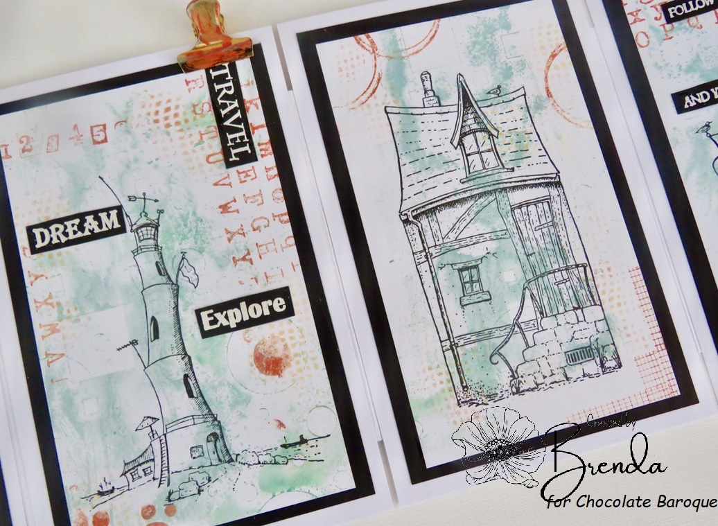
Hello everyone, today we are sharing a compilation of projects showcasing the fabulous range of stamps from
Kim Moody that launched earlier this month on Hochanda. Kim's stamps, which are manufactured by Chocolate Baroque, are a delightful, quirky representation of life on, and by the sea. They follow his previously brilliant house range of stamps that were launched at the end of last year. There are four A6 sets in the range, featuring a large hero image, accompanied by some great little worker stamps to help you complete some scenes, and these can be mixed and matched amongst the sets. The Design Team had a lot of fun working with the stamps, and we hope that you will enjoy this post, and get lots of inspiration from our projects.
Our first projects are from
Kim himself, he coloured
A Dip in the Sea using pencils, to create a soft effect, adding lots of the smaller images to build up a beach scene.
The next three images have all been painted with Koh-I-Noor paints, and the watercolour effect is just fabulous. The addition of the smaller images brings each scene to life. Love the seagull coming to land on the
Jolly Roger.
The
Harbour Master is packed full of details; love the washing hanging out to dry!
Finally
Looking out to See! Kim has created an extended path leading to the cafe or the beach, you decide. The seagull looks like he wants to go for a cuppa or a bacon roll, maybe? You can have a lot of fun adding details as you wish, and using your own colour choices with these fabulous stamps.
Brenda created a brilliant selection of samples for the show, her first project was a card using A Dip in the Sea. She created a dark background with lots of sparkle, and used white embossing for the image. She added some Chocolate Baroque foliage stamps and a favourite quote from a book.
To create her next project, she brayered Distress Inks over a background, and die cut a clock. She stamped the beach huts with Versafine Onyx Black onto patterned papers and cut them out and placed to represent the hours of the clock.
Her next few projects are made using a range of alternative surfaces, showing how great these stamps are for home decor projects. She painted white acrylic paint onto a wood panel, stamped the images and coloured them with water based markers. She sponged in the sun rays with Distress Inks using a torn edge of paper and a punched circle.
She coloured a lolly stick base with Distress Inks, masking a sun, then stamped the ship, masked the wall and stamped again to extend at both ends and coloured the image with water based markers. She stamped the other images and added the sentiment.
She used an MDF monolith onto which she applied gesso, then added Distress Ink. She stamped with Versafine Onyx Black and coloured with water based markers.
A few cards now, she stamped the ship, masked and extended the wall, stamped the other images to create a scene, and coloured with Distress Inks and pan pastels.
She stamped with Versafine Onyx Black, and masked in the middle to add another 'level'. She coloured the image with watercolour.
The background for this card was created with gesso and a fine crackle glaze. Brenda stamped the image with a blue Versafine ink. She added some extra pen lines and stencilling.
The background was brayered and stencilled, she then stamped the image with Versafine Onyx Black Ink, and added a touch of colour with water based markers.
I used one of Lesley's
My Floral Soul papers to stamp the
Harbour Master image, using a dark blue Versafine ink. I coloured the image using pencils, coordinating the colours with the paper itself. I added a large 'porthole' cut from metallic card, and added some screw brads to complete the effect. A sentiment was stamped onto a piece of scrap card left from another project.
I stamped the main image from
A Dip In The Sea onto kraft card using brown Archival Ink. I coloured the image using pencils, deliberately keeping the image muted. I stamped the smaller images onto three circles from the
White Board Hearts and Circles pack. I added a bit of colour around the edges and coloured them in the same colours as before, before adding a thick glaze, and distressing the edges with brown ink.
I chose another piece of Lesley's paper as a background, and then stamped the lighthouse from
Looking out to See! onto a piece of Drawing Cartridge. I extended the scene using a permanent black marker, and like Kim, chose to add the signs to complete the foreground. I masked the lighthouse and the signs before painting the background with Koh-I-Noor paints, stamping the clouds with Distress Inks. I edged the panel with black ink before attaching it to the patterned paper, and added a sentiment to finish.
Rachel's cards are all coloured using watercolour pencils, she has created a set of beautiful projects. This beach scene is so cheery, and reminiscent of Summer Holidays.
Her final card has a vibrant background, she stamped the image over the top, and again she has coloured the image with watercolour pencils.
We have some fabulous envelope art from
Zoe up next, these are really clean and simple to look at, but how special it would be to receive one of these in the post. They are coloured using Inktense pencils.
Another project using Inktense pencils, this time, a tag:
Zoe's final project incorporates one of Lesley's papers, and she has combined two of Kim's sets together to create a scene.
Finally, we have had some help from one of our friends
Pete Simpson, with samples for this show. Pete very kindly created a batch of gorgeous projects, and clearly enjoyed working with Kim's stamps! He has used a range of colouring mediums on the stamps; pencils, pastels and watercolour. All of the sentiments are from Chocolate Baroque.The first batch of cards are all clean and simple in their style, showing the main images can be stamped with a bit of added colour, and maybe using the extra images as an embellishment here or there, or to create a patterned border.
The next batch of cards show a range of backgrounds created with acrylic paints, Distress Oxides, pigment inks, and spritzers. He has created some really atmospheric backgrounds, great for stormy seas, and our mixed weather conditions!
His final two cards have a real wow factor, using white embossing against a bold background.
We hope that you have enjoyed the selection of cards and other projects that we have shared with you today. You can find the stamps we have used in the
Kim Moody section of the website. Thanks for stopping by,