Pin It button on image hover
Showing posts with label self-adhesive labels. Show all posts

Thursday, 21 January 2016

The view from the garden wall (by Lesley)

Hi everyone, today I am actually posting one of my own pieces of artwork. Seems ages since I was let loose on here! Anyway, this one was designed for the TV show when the stamp launched last month and I made it to demonstrate a couple of new techniques. Bit of a long one, so maybe you need to pull up the chair.

  • To create the sky take a piece of 300gsm white cardstock, cut to 5" square. Tap three colours of distress inkpad on to an acrylic block, I used Barn Door, Fossilized Amber and Spiced Marmalade. Spritz with water and then drag the block along the top half of the card.
  • For the grass clean the block and repeat the same exercise using Crushed Olive, Bundled Sage and Mustard Seed.  If you want a less 'yellow green' grass then leave out the Mustard Seed. Again spritz with water and drag along the bottom half of the card, allowing the colours to slight overlap the sky.  Set aside to dry thoughly.
  • Stamp the Walled Garden on to a self adhesive label with Jet Black Archival ink and colour with Distress inks and a water brush. When dry, cut out. TIP: Don't worry about the trailing rose stems on the top of the wall, you can draw these back in later.
  • Peel the backing off the label and position on the background, then trim around the edges.
  • To create the walled effect take another piece of 300gsm white card, approx 5" square, an old credit card and Vintage Sepia Versafine ink. Run the long edge of the card through the inkpad and then 'stamp' random lines horizontally across the white card. Keeping reinking the credit card and continue until you have covered in one direction (side to side).
  • Now repeat, this time stamping vertically between the horizontal lines. You want this criss-cross stamping to resemble bricks. It doesn't matter if it is uneven. Sponge Old Paper Distress ink around the edges of the card to give an aged appearance.
  • To distress around the edge of the card use either a distress tool or run a pair of scissor blades backwards and forwards over each edge to rough up the cardstock.
  • To assemble, glue the background to the faux wall and then attach to a 5.5" square blank Kraft card.
  • Finally draw back in the trailing rose branches using a black fineliner pen.
I love 'painting' with an acrylic block and of course if you change the colour combinations you can have a winter or a pale summer sky, brilliant green fields or something a little more subdued. Best of all you will always 'paint' a unique background since the inks on the block will spread out on the card differently each time you do it. I hope you will try these techniques and create your own view from the garden wall.

Thanks for dropping by and please call again soon for more beautiful creations from our fabulous team.

Wednesday, 10 December 2014

The Beautiful Briny Sea (posted by Lesley)

For my first post using the gorgeous new Steampunk marine themed stamps I wanted to create the illusion of sea foam and bubbles and a great way of doing this is to use Acrylic Wax. This product is manufactured by the company that created Brusho. It is a white fluid that dries clear and is water and heat resistent and was actually developed to use with fabrics, but I have been putting it through it's paces with paper and cardstock.

This is a slightly longer post than normal as I want to explain how you can achieve this technique.

  • Squeeze out a small amount of Acrylic Wax onto a piece of scrunched up kitchen roll and randomly dab across a blank cardstock tag. To try and achieve the sea foam effect I dabbed across the tag in four places, applying more or less wax as I went. TIP: Make sure you don't cover the entire tag or you will not be able to apply any colour. Set aside to dry thoroughly. Depending on how thickly you have applied the wax this can take up to an hour. You know when it is ready because you should be able to rub your finger over the surface without it feeling tacky.
  • Next apply the colour using either brushes, sponges or Cut 'n' Dry Foam. I used Distress inks in Mustard Seed, for the sand, Peacock Feather in the middle and finished at the top with Broken China. Allow the ink to dry and then buff the whole tag with kitchen roll. 
  • Because the wax acts as a resist it sealed in the plain colour of the tag underneath and only taken on the distress inks where there was no wax. For a more subtle, distressed, worn looking background apply a much thinner layer of wax, using a stroking rather than dabbing action.
  • The seahorses are from Steampunk Funky Fish and they were stamped onto self adhesive labels using a Memento inkpad, coloured with alcohol markers and then finished off with coloured pencils. 
  • To add interest to the bottom of the sea I stamped the coral edge stamp from Seaside Dreams using Archival ink in Orange Blossom. To get the faded appearance of the image I did second generation stamping i.e. stamped it first onto copier paper and then onto the tag.
  • Finally the seahorses were cut out, stuck into place and a jumbo brad was attached at the top of the tag to finish.
I hope you get the feeling of bobbing along on the bottom of the beautiful briny sea (a line from the song in the film Bedknobs and Broomsticks) and that you may be inspired to play with the Acrylic Wax.

Thanks for stopping by and watch out for more delicious creations from the girls.


Sunday, 30 November 2014

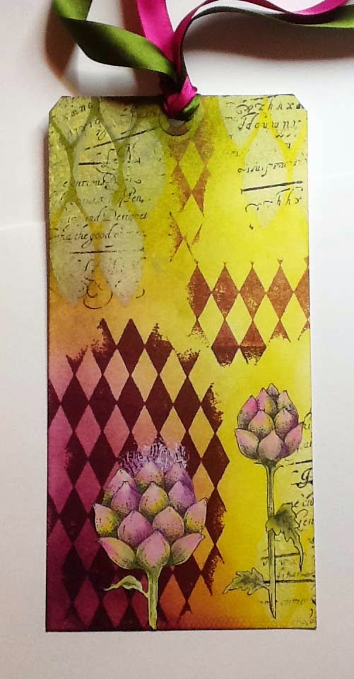
Artichokes and Diamonds (posted by Lesley)

This tag started out as a three colour challenge set for me by Glenda when I was up visiting her in Scotland..She picked three colours of Distress inks for me - Seedless Preserves, Crushed Olive and Peeled Paint and I used these to colour the background on the tag. It was then left lying around for a couple of days because, although I loved the colour combination, I didn't know where I wanted to go next.
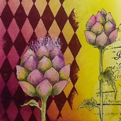
Eventually I decided to use the artichoke image from the Mellow Fruitfulness set. I stamped it onto a self-adhesive label and painted it using the same three Distress ink colours used to colour the tag.. I added some texture with soft relief paste (watch out for this product coming to the website soon) and the Blazonry stencil, then stamped over the top with a script stamp from Eccentric Edwardian
Next I randomly stamped the image from Harlequin Fragments, and stamped the stamens of the artichoke using white paint. I cut out the artichoke images and split them up before sticking into place. Just a few scraps of toning ribbon finished it off.
Sometimes it's good to walk away from a project rather than just keep going because you feel you have to finish something.  If you give yourself some space you return to it with fresh eyes and often a sudden influx of inspiration. 

Thanks for joining me today and keep tuning in for some gorgeous creations from the girls with the fabulous new steampunk stamps.


Saturday, 18 October 2014

Simply Bewitching (by Lesley)

 Today's card is really quick to make and the slim, tall 'A' shape is useful for a variety of styles of card.

  1. To make the card take a piece of A4 thick white cardstock and cut two strips lengthways measuring approximately 6cm in width. Cut one of the strips to 24.5cm in length and score the other at 24.5cm. Attach the two strips togther using strong double side tape to create the top folding card.
  2. Attach a strip of doubled sided tape down the centre of the front of the card and adhere the black spider's web ribbon from the Twilight Limited Edition pack. Add another strip of tape on top of the black ribbon and adhere the orange ribbon.
  3. Die cut a circle measuring approx 9cm and another measuring 4.5cm. Colour both with Adirondack Purple Twlight ink. Stamp the tree image from Things that go Bump onto the larger circle with Versafine Onyx Black and the sentiment from Halloween Edges onto the smaller circle. Stamp the tree image again on a white self adhesive label and then cut out just the moon. 
  4. Remove the backing from the label and stick in place as illustrated. Attach both circles to the front of the card using foam pads.
I hope you will try making this style of card, and if this is too tall you can always adjust the height to suit. This slim card acts like an easel to showcase your art on the front. And remember, there are still plenty of inspiring creations to come from the rest of the Design Team. Have fun

Sunday, 28 September 2014

The call of the Sea (by Lesley)

Hi there, hope you have been inspired by all the fabulous creations that the Design Team girls have been posting here. For my post I thought I would be a small independent island amongst the sea of Christmas, so today's card uses the Seaside Dreams set.

  1. Make the background using the acrylic block technique with Chipped Sapphire, Mustard Seed and Shabby Shutters Distress inks on a piece of thick white card from the Essential A6 card pack. When completely dry take a spare piece of fairly stiff A6 card and tap one of the long edges in white acrylic paint then create a random pattern over the background. Repeat until you are happy with the effect. Don't worry if the lines of paint aren't complete, it adds to the effect if some of these lines are broken.
     
  2. Next stamp the shells onto a self adhesive label using Onyx Black Versafine. Allow to dry thoroughly and then 'paint' the shells using Sunshine Yellow and Butterscotch Adirondack dye ink. Tap each of the colours onto an acyrlic block and spritz lightly with water to create your paint palette. Build up the colour gradually with the Sunshine Yellow and add shading with the Butterscotch.
     
  3. When dry cut out, peel off the backing and stick into place on the background. Add some shading under the shells with Butterscotch. Finally stamp the sentiment with Onyx Black.
You've probably guessed that I use self adhesive labels alot, but they are a quick way of adding an image to your background without having to do any masking. This way you can concentrate on the background and the image and then marry them together to get the finished picture.

Please keep tuning in to get your daily 'fix' of stunning artwork from our wonderful Design Team.

Monday, 8 September 2014

A Seaside Postcard (by Lesley)

I love beach huts, so I was truly excited with the new Seaside Dreams set.  Here is my interpretation of a seaside postcard, using a brayer and one of my favourite supplies, self adhesive labels.

The background was brayered onto a piece of A6 silk cardstock, using Adirondack Pool and Scattered Straw Distress inkpads and then shading was added to give the effect of clouds and sand dunes. The beach huts were stamped onto a self adhesive label and coloured with watercolour pencils then cut out, along with the flag pole and flag, Next the huts were stamped directly onto the background with Adirondack Jet Black ink and the cut out pieces stuck into place. The sentiment was added as shown..

I am a great advocate of using self adhesive labels, especially if you find masking difficult  It is what I call cheat's masking, why not give it a try. I hope this may have inspired you to create your own postcard and if you would like to read the full tutorial on how it was made you will find this on my blog.

Please keep coming back on a daily basis to see loads of other uber inspirational ideas from the fabulous design team girls.


Thursday, 15 May 2014

A spotlight on the Twenties

It's been some time since I contributed one of my designs to the DT blog, however I intend to blog on here every month from now on; so let's start with May's offering.

When I first saw these Fabulous Flapper stamps I knew exactly how I wanted to use this particular image. During the art deco period it was all about shapes and angles and I liked the idea of using a circle to spotlight this lovely lady.

To create the spotlight illusion I stamped the upper part of the image with Tuxedo Black Memento ink onto a self adhesive circular label. I happened to have some in my stash but you could die cut a circle from an A4 single label sheet. I then coloured the image with my alochol markers and set aside to dry.

The card itself is a piece of A4 dark grey pearlised cardstock folded in half from which I trimmed off 1.5" down the side edge. I found a twenties advert amongst my ephemera stash which I glued to a piece of plain card to give it some strength. This was then attached to the front, overhanging the trimmed edge.

The image of the flapper was stamped onto another item from my stash (a Whist scorecard). Once dry I stuck the self adhesive circle over the top, ensuring the images were matched up. This was then matted onto a piece of Old Gold pearlised card and attached as illustrated with 3d foam.

Finally I stamped the words 'Just a Note' from the Mackintosh Sentiments clear stamp set and finished it off with the ribbon.

I have been using self adhesive labels for many years now and find them useful for all sorts of crafty projects. However when it comes to stamping they are an easy way to add an image to a background without having to create a mask. 

I hope you are inspired by all my fellow DT members' beautiful artwork, there are more gorgeous things to follow so please keep watching.


Saturday, 9 June 2012

It's not yellow!


Well hello there, thought I had better start contributing to the DT blog and what better way than with these gorgeous sunflowers. This brand new stamp set, Sunny Sunflowers, is so versatile that it just inspires you to play.

The first thing you will notice, apart from the stunning detail of the stamps, is that these are not yellow.  I decided I wanted to create something a little different, and as I have said many times "this is my design and if I want purple trees/green sky etc then I shall".  It was actually the colour which inspired me first so I began by sticking a page from an old encyclopaedia to a hand cut tag ( I used Claudine Hellmuth multi medium - great for all sorts of projects).  I then lightly painted over the top with matte acrylic paint, just to shabby it up a little.  Once dry I used a stipple brush to add Tumbled Glass distress ink around the edges and followed up with some toning oil pastels to build up colour.

For the sunflowers and leaves I stamped several images onto self-adhesive labels* using Adirondack pigment ink in Pitch Black.  Then I set to and coloured them using a selection of alcohol markers and oil pastels. Once completely dry I cut them all out, peeled off the backing paper and stuck them in position.  I used a grey marker to create the shadow around the images.  Finally I added some paper flowers, pins and gems. So even if they are not yellow I'm quite pleased with my sunny sunflowers.

Thank you for visiting and please keep coming back to see what other goodies my DT buddies have come up with.

Lesley

* Self adhesive labels are brilliant for stamping on.  You can colour the images with a variety of mediums and then once you cut them out you have an instant sticker - no trying to glue awkward, fiddly little areas.  Also fabulous for printing your downloads and backing papers onto.  You can punch them, die cut them, use them for matting and layering.  We currently sell A4 single sheet labels on the Chocolate Baroque website, why not give them a try.