Pin It button on image hover
Showing posts with label Take It or Leaf It. Show all posts

Sunday, 10 July 2022

Making Your Scrap Papers Work For You (by Judith)

Hello everyone, I hope that you are keeping well. I have a couple of projects to share with you showcasing some of the retired stamps that we brought to the TV shows on Create and Craft last month. The TV shows were so busy, and if you were watching, you would have seen that we had to change our demos, sometimes in the middle of what we were doing, it certainly made us think on our feet! 

I wanted to share two of the projects that I talked about during the shows, although one you did not see in its completed version, I made a different version on the show due to sellouts of the stamps that I had planned to use.

Often we have bits of card and paper in our scrap boxes that do not seem to go together, a piece of card left over from a crafting session that is blue and purple, and a piece of brown card. Whatever would make them work in a project together? 

I like to mix and match my scraps together, and can easily put these pieces with each other by using toning inks. I used the piece of tea dyed card as the large background, stamping a small worker stamp randomly all over using various shades of blue and purple, then edging the card with a blue ink. I then stamped a large flower three times onto the blue/purple card using purple Versafine Clair ink and clear embossing powder. I cut the flowers out and adhered them to the background, adding a piece of scrap corrugated card underneath the third one to raise it up slightly. I can add a sentiment at a later date when I know what the card will be used for.


My second project was created by taking a piece of greyboard and painting it with white paint. I added torn strips of book paper and then painted the whole piece with acrylic paint. I chose a pretty green paint, and some touches of plum around the edges. The green paint allowed the book pages to still be seen, as it was not completely opaque. I added some stencilling with Plum Archival Ink, and stamped a pretty leafy sprig from one of the retiring stamp sets, Take It or Leaf It.

I chose some patterned papers to stamp and emboss birds from Sing Your Song, Live Out Loud, and Fly Away With Me. I added a bit of colour using Distress Inks and a blending brush to make the papers fit my colour scheme. I also had some left over card from another project, which had originally been blue and green. It did not match my colour scheme, but I had some of the plum paint from this project on my craft mat, so I spritzed it with water, and splattered it over the card, to tone the card in with this project.


A very simple way to get the card to match. I then stamped the sentiment onto a die cut piece of the card, and sponged some of the Plum Archival Ink around the edges. Finally, I attached the birds to the leafy branches, and attached the sentiment to the panel.

Thanks so much for stopping by, I will be back later in the month with more projects to share.


Take care,


Judith xx


Sunday, 29 September 2019

Colourful village


Morning Peeps, Brenda here again and this time I do have the right cards as the lovely Lesley very kindly took photos of my work (some will remember in my last post I explained I forgot to take photos before posting off my samples.......naughty corner for me), so a big thank you Lesley.

The card at the top uses all four of the new houses which you can find on the multi buy here, all were stamped in versafine black and masked so I could add the background, a Pan Pastel sky and some worker stamps around the houses. I coloured them with Koh-i-nor paints


I kept Kim Moody's Poppy Cottage fairly simple as I wanted to use red to reflect it's name stamping in Versafine Clair, adding just a little colour, matter and layered and some Poppies from Pretty Poppies which I coloured with pencils.


Here we have Bridge House which I stamped first onto acetate to get a reverse print and laid my card onto that, then stamping a second time to extend the house, coloured in with Koh-i-nor paints again as well as some Distress Markers and some foliage stamped in the foreground.


Both of these were stamped with Versafine Clair inks, some colouring added with pencils and stencilling in the background.


Poppy Cottage again, this time with a background stamped with Versafine Clair and Poppies again from the Pretty Poppies set. I added some colour to the doors of the house and inked around with DI's along with a sentiment from the same set.


Bridge House again, this time coloured in with Distress Inks and Markers, a tree created with stamps from Orchard Design a Tree along with more leaves from Take it or Leaf it set.

As always, many thanks for your visit today.

Friday, 22 February 2019

Katya Messenger Bag (by Anne)


Good morning. I was so excited about the launch of the new fabric panels from Chocolate Baroque – enlarged images from my favourite stamp company printed onto fabric ready to paint and stitch – yay!
I have been working on a bag design big enough to carry A4 folders plus craft stash for when I am out & about. The large bag flap was a perfect place to feature the Katya panel. You could create similar using a commercial bag pattern (messenger style or tote), or by applying the panel to a ready made bag front.
I have used fabric painting, stamping, applique of stamped images, stencilling, machine and hand embroidery – but don’t despair if you are a non stitcher. I have included an idea for decorating a ready made tote bag with no stitching involved. The panels are also fabulous to use in mixed media projects such as book covers or canvases too – just stick it down with some gel mat medium or book binding glue. Then add stamping and embellish as for other mixed media work.
Materials used:
  • Printed fabric panels (3 Ladies)
  • Stamp sets: Take It or Leaf It, Large Crackle Background, Artistic Affirmations, Harlequin Rose, Bold Blooms
  • Stencils: Silhouette Palace 1 and Silhouette Palace 2
  • Range of fabric paints from my stash – all fixed by ironing: silk paints (fluid), transparent and opaque fabric paints plus multi surface paints (off white, cream, red, orange, yellow, blue, turquoise, pink, purple, metallic pink/purple, transparent pearl and green glitter)
  • 3D fabric paint (pearl green) – such as Appliglue or similar
  • Alcohol ink pens (yellow, turquoise, pink, green)
  • Archival Inkpad (Jet Black)
  • Tonertex foiling fabric glue and foil (gold)
  • Cotton quilting fabric scraps for applique (white, purple, lilac, cerise, plus waste strips of printed batik)
  • Cotton fabric (black) for backing and framing panel
  • Machine embroidery threads (black, variegated pink/blue plus green/orange)
  • Hand embroidery threads: Stranded cotton (variegated pink/purple and orange/yellow), Pearl 5 cotton (variegated blue/green/turquoise)
  • Iron on paper backed glue mesh (such as Bondaweb or similar) and Fray Check Glue
  • Paint brush and Cut-N-Dry Foam
  • For making the bag I also used: sewing thread, heavy weight cotton fabric (blue), light weight linen patterned fabrics for lining (blue & cream), plastic sink drainer (for base), Bosal foam stabiliser (one side iron on), bag feet and magnetic clasps (silver colour), zipper (blue), shoulder strap (recycled from old bag)
How it was done:
I first made a lining using my heavy weight cotton and linen printed fabrics. I wanted a heavy weight long lasting lining so layered my fabrics and treated as one layer. I also included plenty of pockets. I haven’t included details of my pattern here – sorry – but it’s something I am working on for my own business. You could choose a commercial pattern for a messenger bag with a large front flap to decorate, or a tote style bag to feature the panel.
I painted the Katya panel using transparent coloured paints so as not to obliterate the black outlines.
Fabric paints designed for light coloured fabrics are best suitable. Opaque colours (designed for dark fabrics) would obliterate the printing so you need to bear this in mind. I also used some paints designed for multi surfaces (including fabrics). These can sometimes leave a stiffer finish than those specifically designed for fabric. However, for a bag this can actually be a bonus and it is not essential to keep a soft fabric feel. If you are not intending to wash your fabrics then you can use just about anything that you would use on paper. However, I would recommend heat fixable paints for a bag as you don’t want colours to transfer from the bag or run if caught in the rain! Painting was fixed by ironing.
Tip: I like to leave my fabric painting overnight before heat fixing with an iron (follow the manufacturer’s directions). The panel is silk/cotton so can be ironed using a cotton setting safely. I usually iron from the back.
I did test the panel for compatibility with alcohol markers and found that if over wet and rubbed with alcohol the printing did bleed slightly so I would avoid these, or use with care (i.e. without flooding close to the printing).
I then applied some of the Tonertex glue, left to ‘dry’ (goes tacky as dries clear) and applied gold foil to elements of her headdress.
If you are not a sewer you could stop at this stage. As with card making the panel benefits from ‘mat & layering’. Black fabric provides a nice frame. You could back the fabrics with fusible web and iron onto a ready made bag. Heat fusible webbing does not always provide a strong hard wearing bond so gel mat medium, book binding glue or a fabric decoupage glue could be used to prevent the panel lifting off or fraying with extensive use. There are also several types of 3D paint that could be applied around the fabric edges too (e.g. Appliglue).
I found some lovely strips of batik fabric in my ‘waste’ scraps bag (I knew that they were too nice to bin – ha ha) so I had to include them in my bag panel design. Nothing was stuck down yet.
Next I stamped various colour fabric scraps to use as applique elements, using an Archival Inkpad. The images were dried and then heat set with an iron. Colour was then added using alcohol ink pens. Again colours were heat set. 
Fusible web was applied to the back to prevent fraying and the stamped and coloured images were cut out.
When stamping with paints I prefer to apply them to my stamps using Cut-N-Dry Foam. I find that it gives a more even application with less clogging of the stamp than brushing or using kitchen sponges etc. In addition if placed paint side down in a plastic tray (recycled) they stay wet for longer. This is particularly so for multi purpose paints that can dry out very quickly. I also spritz the tray lightly with water to help keep them wet while working.
The fabric background was first coloured using the fluid silk paints (they are like an ‘ink’ formulation rather than thicker paint) – encouraging them to bleed and blend with a light water spritz. As with card making I tried to create a darker blended edge to frame the scene.
Next the bag panel was stamped and stencilled. The applique elements and panel were ironed down (using the fusible web backing). I used the border stamp across the top edge and lovely crackle stamp in the background. I had to add a little bling with the metallic colour too (you know me! – ha ha).
Tip: Stamping onto a darker fabric you will need to use darker or more opaque paints (or they won’t show up). Metallics work well too.
I added some 3D glue ‘pearls’ to Katya’s headdress and overlayed some areas with transparent pearl paint for extra shimmer. I also added glitter paint to some areas. Simply wasn’t enough bling already.
The panel was backed with foam stabiliser before embroidery (I wanted a quilted effect). I stitched down the panel and fabric strips and then used free machine embroidery to stitch down and decorate the applique. Hand stitching was added for additional texture.
Note: The fusible web backing does help prevent fraying but some areas may benefit from a little Fray Check along the fabric edges (e.g. my batik strips were not backed with webbing before stitching down so are likely to fray with wear).
Detail showing stencilling, stamping and embroidery.
I used free machine embroidery and black thread around the applique motifs, then further embellished with hand embroidery. The stamped smaller flowers were free machined with variegated thread.
Here you can see the stencilled palace with additional hand embroidery to highlight. 
The back panel was also decorated.
Love this sentiment stamp – describes me perfectly.
So happy with my decorated bag (back).
The pockets on the front panel were also decorated (sits under the front flap).
Detail – love this sentiment too.
The finished pockets with magnetic snap closures (to hold down the front flap).
I also decorated the little side pockets.
Texture added with hand embroidery.
Here you can see a little more detail of the free machining and hand embroidery on the main Katya panel.
I hope that you have enjoyed my latest creation.

Hope to be back with more soon, Anne xxx.


Friday, 13 July 2018

Checkered flowers (by Miranda)


Hi there lovely people,


It's been a while.......but I am happy to write a guest design post and get the chance to play with my beautiful CB stamps!
 This time I've used the stylish Chequered flowers. I stamped on the beautiful patterned paper from Crafty Individuals. So no need to create a background this time.......

I stamped using a stamping tool. I used several soft ink colors from Memento. Than the fun starts.......colouring with coloured pencils. One of my favorite techniques.

I've added some extra dots on the upper flower and embossed the lovely leaves from the Take it or Leaf it set. Really love that one!

Than I stamped the word ' Love' from the Artistic Expressions sheet.


Here is the full version of the card........

Maybe you are inspired to take out your patterned paper and have a play? 

Thanks for watching and till next time,

Saturday, 3 March 2018

Trees For Leaves (by Julie)

Hello, today I have two cards to show you.


My first is stamped with the Townhouses set and the leaves are from Take it or Leaf it.
I stamped the leaves on my plain white card blank with green Versafine ink and then on separate card-stock I stamped the trees from Townhouses to form the flowers. Each flower is made up of two sets of three trees, so I stamped the first tree at 12 o'clock the second at 4 o'clock and the third at 8 o'clock. You can overlap the base of the trees in the centre as this will be covered up by a flat back gem. Do this twice for each flower, cut out, colour with Distress ink and then arrange so the tree petals don't overlap each other before gluing together with pva glue. 
The card is finished off with a sentiment from Birthday Words


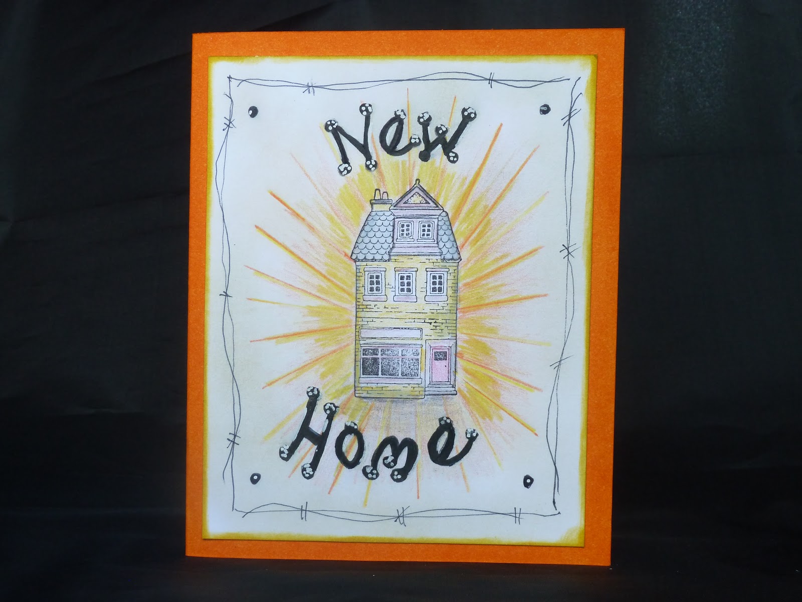
My second card's cute house comes from Village Life. I stamped the house with Onyx black Versafine and then coloured with pencils. The sun-rays were created with a ruler and a yellow and orange colouring pencil. I wrote the New Home sentiment freehand with a fine liner pen. It started off as just a single pen line but I gradually thickened the line with my fine liner pen so it stood out. I drew a border around the outside with the fine liner before cutting out and mounting onto my base card.

Thanks for looking and please call back for daily Design Team inspiration.

Julie xx

Saturday, 21 October 2017

poppies (by Veronica)

  I am an absolute sucker for poppy stamps, so it was lovely to have these stamps back in the spotlight.
The butterfly poppy set is A4, so there are lots of images to play with. I used the large scripty image to make the background, stamped in hickory smoke distress ink and sponged witht he same ink.
I inked up the main image using distress markers, using one colour at a time and my stamping press to make sure the images matched! Doing it this way meant that the ink stayed damp, and any in the wrong place could be removed easily. This was on white card, sponged with wild honey distress ink after stamping and tearing round the image. I curled up some of the corners as well before gluing down

 The background here is grey again, leafy spray from take it or leaf it. Image from poppy meadow stamped in black versafine ink and coloured with watercolour pencils. Die cut in an oval shape, which was edged with black versafine by running the diecut along the pad.
three small gems to finish


Third card uses the script and poppy head stamps from butterfly poppy to create the background, stamped using wild honey distress ink and sponged edges with the same ink.

The main image was stamped with brown ink onto white card, sponged with the same ink on the harlequin bit and very lightly across the script to try to suggest antiquity. Pured with marker pens, then cut out and glued over the original image - I didn't try to cut the antenna out!


A very quick card using an image from pretty poppiespoppies , stamped using versamark and white embossing powder, then red and green distress inks sponged across the image


                                                                                               Lastly a card using another stamp from pretty poppies, stamped directly onto a 7"x5" card blank using black versafine ink, and coloured with watercolour pencils. Sentiment also on the same plate.
Another very quick card.


Sunday, 27 August 2017

A Mixed Bunch (by Judith)

Hello everyone, I have more projects to share with you using the fabulous new stamps featured on last month's shows on Hochanda.

I was very taken with the Floral Harmony stamp, and love the flower head image part of the design in particular. I decided to use this as the focal point for a couple of my projects.

I applied texture paste through the Useful Leaves Stencil onto a large Tando Tag, and allowed this to dry completely. I covered the tag with gesso, and once this was dry, applied a combination of pale pink and turquoise paint to the background.

I stamped the leafy spray stamps from the Take It or Leaf It stamp set, using teal coloured ink onto the background. I stamped several of the floral images onto to some spare white card, and coloured them using water based markers. I added a bit of Stickles to the centres for added bling. I coloured a piece of white card with water based marker that I had scribbled onto an acrylic block and spritzed with water. I then die cut a small rectangle and stamped a sentiment from the Amazing Mackintosh Words stamp set. I edged the rectangle using Distress Ink.

I added the flowers and sentiment to the tag, and finally coloured some ribbon using the same paints as I had used for the background, to give a coordinated feel to the project.


For my next project, I rummaged through my stash, and found some brightly coloured backgrounds, and cut out some squares of orange card, I then inked up the flower head part of the stamp, and pressed the squares of card onto the stamp to obtain the image. I also stampd several of the large leaves from the Take it or Leaf It stamp set, and then cut all of the images out. I arranged them onto a large black card blank, to create a wreath shape. I added some Stickles to the centre of the flowers once again, for a bit of sparkle.

I die cut a circle from another piece of the orange card, and stamped a sentiment from the Amazing Mackintosh Words stamp set.


For my final project, I decided to work within my favourite colour palette, and created a soft background of turquoise and purple, using Distress Ink. I stamped the Baroque Corners using Archival Ink, and added a sentiment from the Amazing Words stamp set. I edged the background with a toning Distress Ink.


I have thoroughly enjoyed working with these lovely stamps, and hope that you have been inspired to try out some of the ideas that you have seen shared by myself and the rest of the Design Team. Thanks for stopping by, xx

Friday, 25 August 2017

Make a Wish (by Brenda)


Morning Peeps, I am back again with a few more shares using the lovely new stamps Lesley launched on Hochanda a few weeks ago.

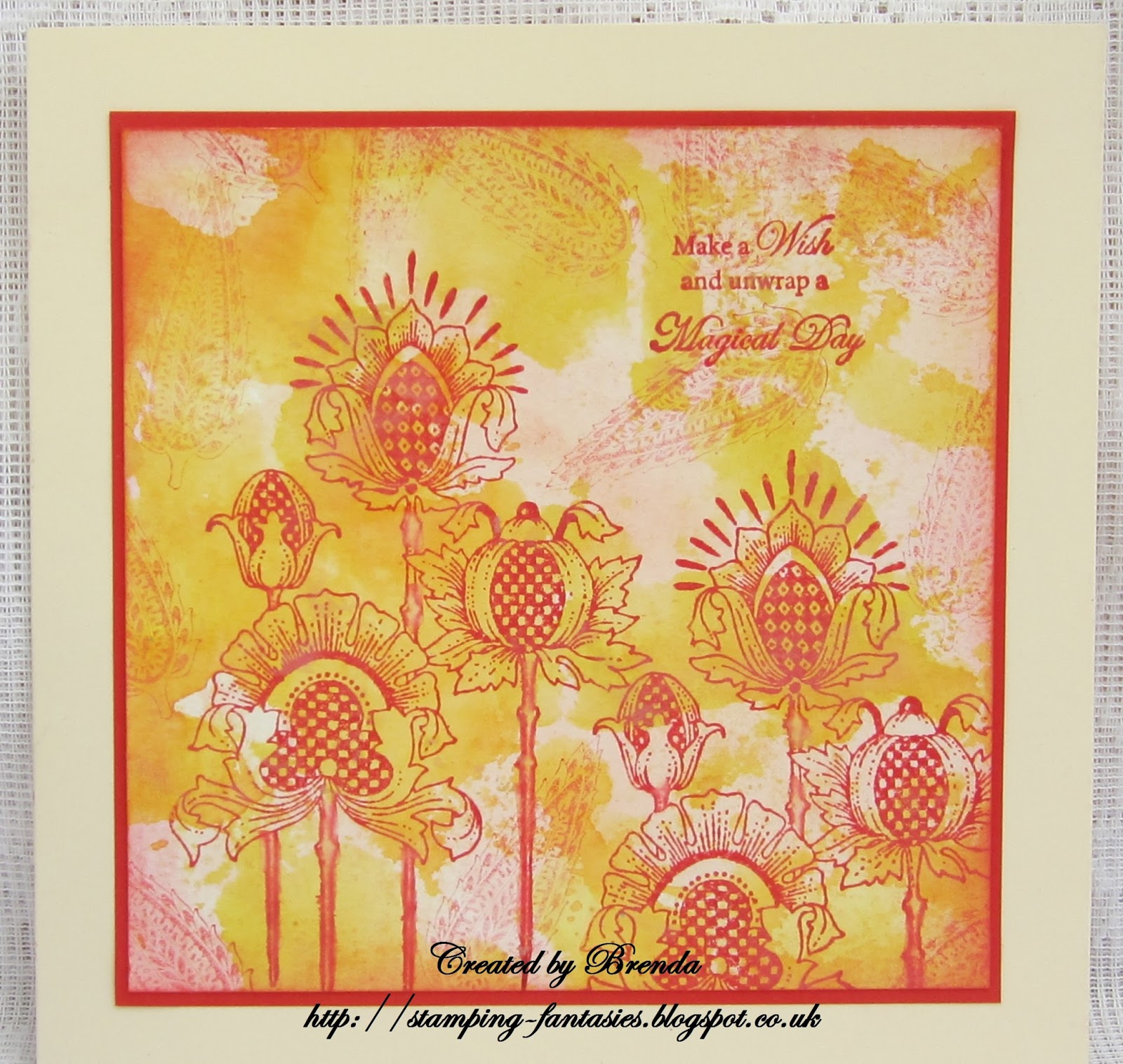
The background of the above card is actually the leftover from another one which I mopped up from my craft mat and rather likes the the muted colours. Using the small leaf from the Take It Or Leaf It set I randomly stamped the background with second generation stamping and a red Distress Ink, I then used the first generation ink to stamp the Chequered Flowers which I have to say I just love, they remind me of Thistles but with so much more interest going on. Finally I added a sentiment from Words to Dazzle and Sparkle.


A canvas now which I primed with Gesso, then acrylic paint and crackle glaze before adding leaves and 'spots' using Useful Leaves and Seasonal Elements stencils and texture paste. When dry I placed the stencils back in place and coloured with acrylic pain, then using the same paint coloured some elements from one of the colouring pages from the Colouring Collection which I then cut out and added to the canvas. I added three chipboard Butterflies painted with the same colour and stenciled some leaves onto the largest. Finally some gold Gilding Wax here are there and a sentiment from Amazing Mackintosh Words.

My thanks for popping in today and I hope you have a lovely weekend.