Hello everyone, it is time for our monthly crop of projects from the Design Team as a whole; cards and miscellaneous items that we have made to inspire you, taking no more than fifteen minutes to complete. We aim to share tips and ideas with you for time saving ways of creating projects that will look as if they have taken much longer to complete. These ideas will be great for batch cards, cards in a hurry, craft fairs and fund raising. There are no limits as to how many cards you can make with Chocolate Baroque stamps, as long as each image is hand stamped.
So, grab a cuppa, and enjoy what we have to share with you this month.
Lots of our projects are based on last month's TV shows stamps, and you will see a general theme running through the stamp images. However, it will show you how much variety can be achieved by changing the colours, background and layout of a card. This will be very useful for you to see the versatility of a stamp and how much variety you can achieve, how much you can stretch a single stamp. If you have a stamp in your stash, imagine how much use you can get from it by changing small things.
The
Blossom and Grow stamp set features heavily this month, I think we all felt that these images were ideal candidates for quick cards!
Rachel has treated this image in two very different ways, for her first card, she stamped and embossed the image onto kraft card, using Versamark and white embossing powder. She then coloured the image using pencils.
Her second card was created by stamping the image and colouring it with Distress Inks. She then masked an area around the image off and coloured the rest of the card with Distress Inks.
Her third card was made using a premade background from her stash, created using mica based powders spritzed with water. She stamped using Archival Ink and the image was coloured with sparkle pens.
Two cards from
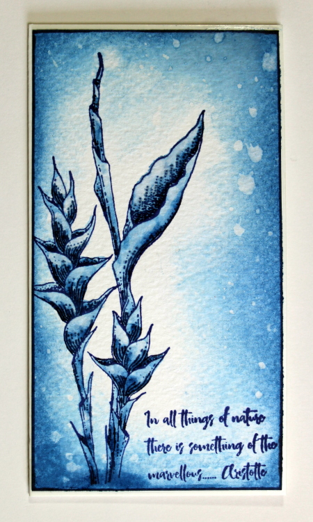
Anne next, using the same images, but showing how different the cards can look. She has gone with the blue and white theme that she loves so much. She stamped the images and sentiments with Versafine (Majestic Blue) and coloured with a dark blue watercolour pen. Colour was scribbled onto areas requiring the darkest shading and the colour dragged out with a damp brush. A good quality stamping card or watercolour card is needed for this technique to work.
Extra colour was sponged around the edge of the second card, splashed with water and lifted off with kitchen paper to give added texture to the background.
I have chosen to use soft vintage colours when using one of these images. I stamped the image using green ink onto linen texture card, and painted the image using Distress Inks and a water brush. I created a background using an image from the
Scrumptious Succulents stamp set, stamping randomly over the linen textured card once more, using the same green ink. I edged both pieces of card with the green ink to create a border. I have left the card without a sentiment for now, and can choose my sentiment later to fit any occasion.
We have a mixture of cards from
Magda up next. She created a series of Birthday cards for some male relatives this month. She needed to make several cards, and by varying the layouts slightly, everyone received a unique card. This is a great idea if you have lots of cards to make.
Another Birthday card, mixing background stencilling, stamping and a bit of decoupage:
Finally, a watercoloured card, the warm pinks and oranges really set off the green cacti.
A card from
Gerrina next, using one of our
Steampunk Birds. She has used Perfect Pearls and Versamark with a stencil to create an interesting background.
Next up is a selection of cards from
Brenda. Her first card was created by using a stencil and Distress Inks over the background. She stamped and coloured a butterfly on a spare piece of card, using Distress Ink. She cut the butterfly out and decoupaged it onto the background.
For her next card, she created a soft background with Pan Pastels, inked and stamped the floral images with water based markers and heat embossed them with clear detail embossing powder. She fixed the background behind a die cut frame. She used a stencil and Pan Pastels to add the wording.
For her third card, she used a circle mask, inked around the edges, inked the rose image with Distress Inks and dragged out the colour with a waterbrush.
For her next card, she created her background with Pan Pastels, stamped and cut out the flower three times, and added some twine and some gems.
Now we have Brenda's take on the
Blossom and Grow stamp set. She stamped the sentiment and image with Versafine Onyx Black ink, and coloured the image with sparkle pens:
For her final card, she stamped the setiment with Versafine and inked the image with water based markers, dragging out the colour with a waterbrush. The toning ribbon on both of these cards adds a lovely touch, and really pulls out the colour of the focal images.
A pretty card from Carole is next.
Stamps used:
Essence of Nature ,
The Rose Tree and
Pretty Poppies. The top of the Rose Tree is stamped with Picked Raspberry Distress Ink and brushed over with a damp brush to bleed the colour slightly. The butterfly tree is stamped with Versafine and coloured with the same Distress Ink as the background. The words are stamped onto parchment paper with a permanent inkpad, but you could use Versafine and clear embossing powder. The parchment gives a softer look to the sentiment. She used spray mount to attach the parchment to the card.
Vronnie has created a very simple but elegant card. She has used Versamark and silver embossing powder to create her finished card, stamping the image and sentiment with Versamark, then rubbing around the edge of the card as well. She has added the silver embossing powder, heat set everything, and then attached the card to a plain white card blank.
A softly coloured card from
Julie is next. She has added a blended background to the images and complimentary matting, bringing the whole card together.
Finally we have three cards from
Pat. Her first card has a Brusho background, and she has stamped and embossed the images using white embossing. She has then painted the images with a waterbrush, also using Brushos.
She has created an alcohol ink background for her second card, and stamped the image and sentiment using a permanent ink. She has coloured the image using alcohol inks and a blending solution.
Her final card was also created using an alcohol ink background. She has used a blue permanent ink to stamp the image twice, and coloured the images using water based markers.
As you can see, we finished up with the same image that we started with, but it looks very different!
We hope that you have enjoyed our selection of projects for this month. We will be back next month with another bumper selection of quick projects to share with you. In the meantime, do keep visiting the blog for a daily dose of inspiration from our regular Design Team posts. Thanks for stopping by,


Wonderful cards from all the ladies, all so different even using the same stamp xx
ReplyDeleteBeautiful inspirations, as always there is a lot to see for feeding mojo :)
ReplyDeleteBeautiful bunch and great to see the versatility of one stamp!
ReplyDeleteLots of fabulous inspirational projects. Thank you ladies.
ReplyDeleteHugs
Linda xxx
Absolutely beautiful cards, such a talented bunch you all are, Kate x x
ReplyDeleteAll so lovely! It takes me more than 15 minutes to pick the stamp I want to use!!!
ReplyDelete