Once again this month I’m showing you some samples I made a while back, I was unable to make new samples for the last show on The Craft Store.
Thank you for visiting today I hope you like my creations.
Have a wonderful day xx Zoe xx

Hello and welcome
I am back with my second post of this month and want to share with you 2 Cards and a Tag.
Journaling Card :


Sitting Pretty


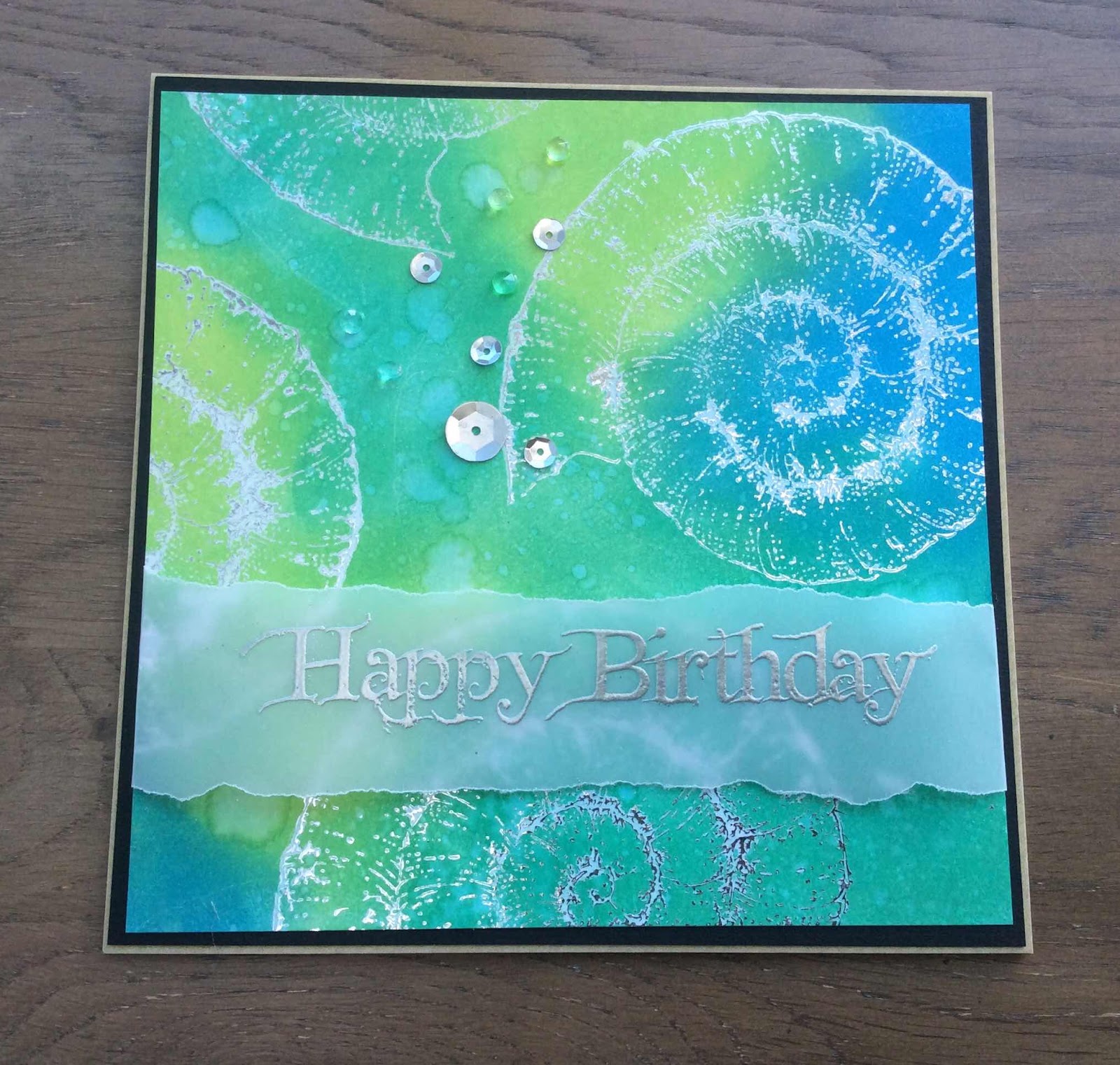
Hello, I am back with my last blog post for this month.

Stamped the cogs from the Steampunk Butterfly set.
I then stamped the flowers using Black Versafine ink.
Colouring them in with Distress ink and highlighting with a white pen.
Next, I stamped the keys onto the background.
Finally, I stamped on the sentiment.
I will say bye for now,
Doreen
Hello Peeps thank you for dropping by.
Today I'm going to explain a card I did for the recent Chocolate Baroque TV show.
Begin with an A5 piece of card stock and trim 2cm from the long side and short side, (this will allow for matting and layering later).
Apply Distress Oxide in Salvaged Patina and Speckled Egg all over the card. From the Steampunk Butterfly stamp set use the quarter circle stamp using archival watering can ink pad and stamp either side of the long edge all the way down creating a type of border.
Trim a piece of card to 19cm x 6cm, as before apply Salvaged Patina and Speckled Egg Distress ink.
With the Watering Can, ink up the butterfly stamp, first stamp on to scrap paper then randomly on to the card, so using second generation ink. Stamp over the whole panel.
Apply more Salvaged Patina and Speckled Egg to piece of card big enough to accomodate the butterfly stamp. Dry with a heat gun, now this is important, you need to make sure this is absolutely dry as when we apply the embossing powder, we only want it to stick where we stamp. Go over it with an anti-static bag as well.
Ink up the butterfly with Versamark clear ink, stamp image and apply detail silver embossing powder and heat set. Fussy cut out the butterfly.
Matt and layer big panel onto brown card and attach to A5 card blank, with the thin panel matt and layer long sides only onto same brown card, attach to main panel.
Using foam pads attach butterfly to centre on card.
On some scrap card (possibly the 2cm scraps you have just cut off (you did save them didn't you))!!! stamp the words "Take time to Breathe" on to two pieces of card from the Punky Expressions stamp set using Versafine Majestic Blue. Rough up the edges or tear them, apply Walnut Stain to the edges.
Cover the pices in Versafine and apply clear embossing powder and heat set, do this twice more and repeat with the other piece. Attach "Take time to" in top left using foam pads and "Breathe" in the bottom right.
Job done.


My first simple sample uses the cogs stamped in versafine clair in one corner, and gold and silver embossing powder sprinkled over quickly. The butterfly was stamped once over the cogs in black in - too lazy to cut the antenna out!- and once in versamark onto black card. White, silver and blue embossing powder sprinkled over, fussy cut out and glued over first image. Black mat onto white card blank to finish


I owe Lynnda Worsnop for this idea, and Doreen Sympson on whose blog I originally saw this - thanks ladies!
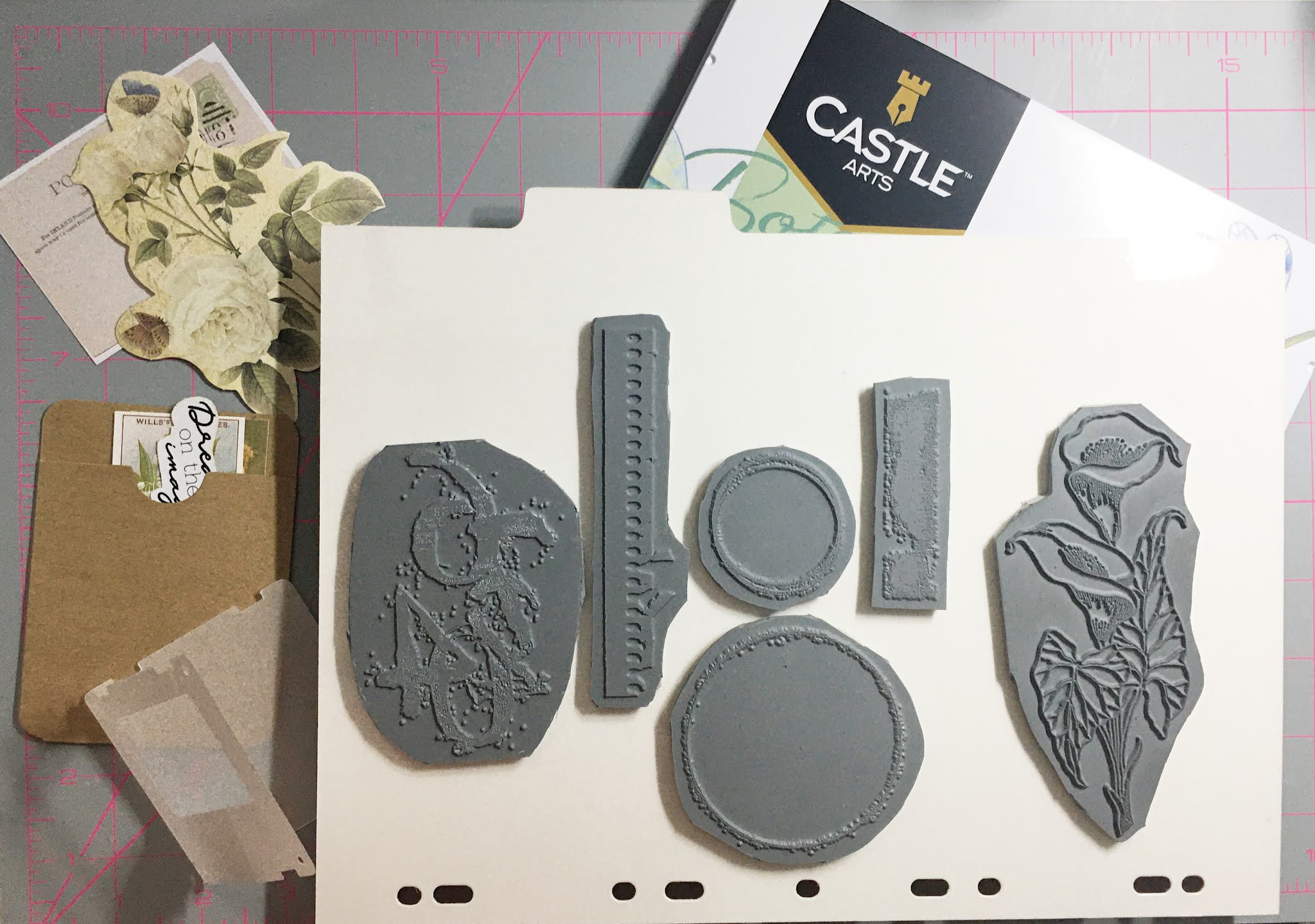
I love the look of junk journaling: vintage illustrations, centuries old ephemera and worn paper and lace. I thought I would have a go at replicating the look with my Chocolate Baroque stamps.
You will need:
Just Useful stamp set
Make Your Mark stamp set
Flora and Fauna stamp set
Beige ink pad for stamping
Distress Oxide Weathered Wood
Coloured pencils
Assorted ephemera
Assorted ephemera and papers from a vintage pack
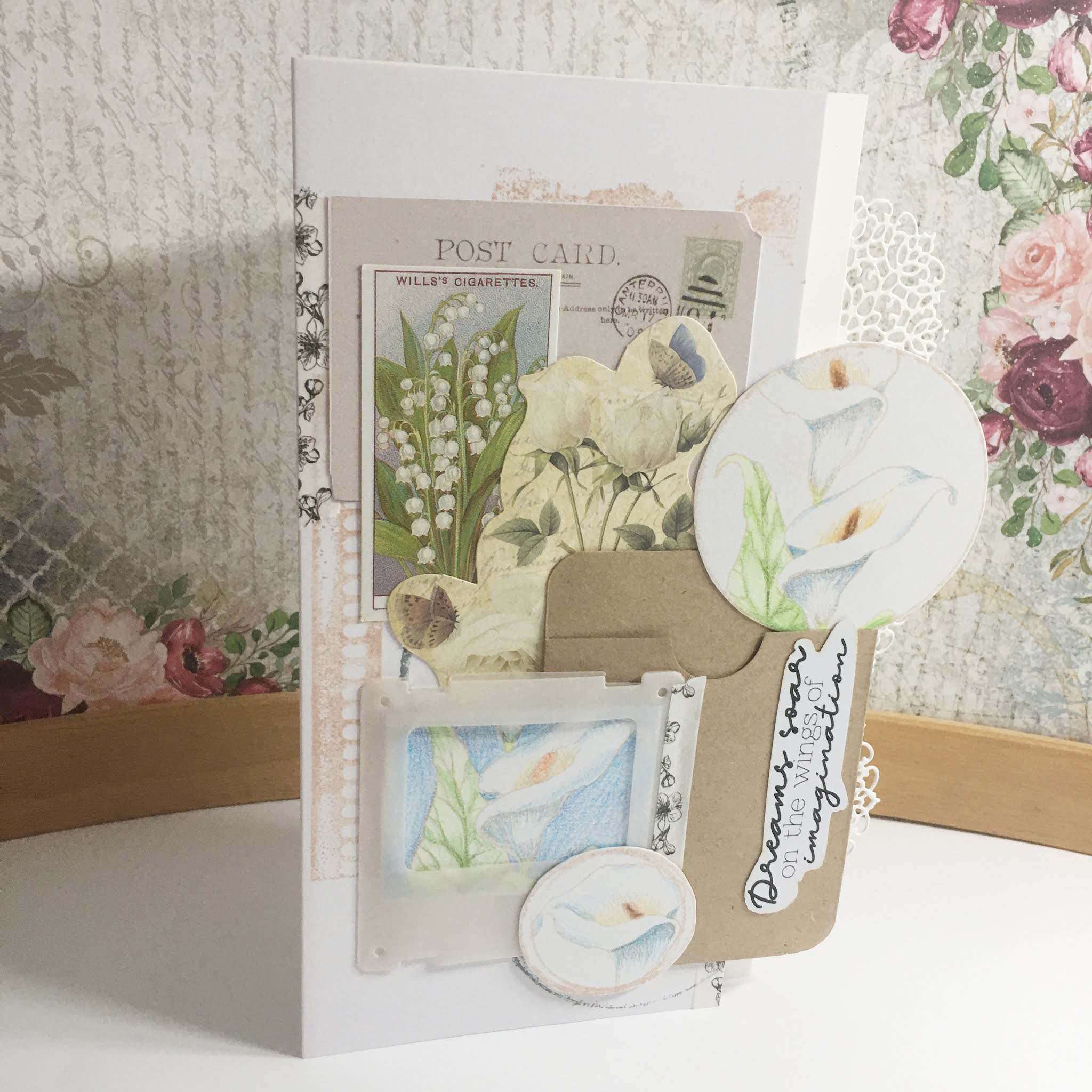
Start by combining ephemera elements into a rough pleasing layout. Keep in mind the elements from your stamps you want to include; for my card these include a stamped image for the photo mount, and each of the two rings. This also gives you a rough idea for positioning the texture images into the background of the card.
Colouring your stamped images
Stamp your main image three times onto some white card using the beige ink. The card you use should be suitable for coloured pencil colouring; I recommend testing a scrap piece prior to stamping.
One image should have the larger circle overlaid, another smaller circle and the last image I roughed out an area that would fill the frame. The circles should highlight focal points of your main image.

Starting with a cream or pale warm yellow (mine was Golden Yellow) colour the back petal around the stamen. Fade the colour out as you move further away from the stamen.
Colour the stamens with orange, tan and brown - orange at the edges and getting darker towards the centre. Colours used from the set I used: Cadmium Orange, Terracotta Light, Raw Umber and Burnt Umber.
The rest of the petal should be coloured from the base up; starting with a touch of light green (Leaf Green Light) to the very base blending from the stem. Then apply grey from the petal base upwards past the green (Payne's Gray). Finally, blend into the white with pale blue (Cerulean Blue Light). Do the same blue grey mix to the shaded areas of the petal.
Stems are coloured in light green as we don't see much of them on these pieces.
Leaves are coloured all over with light green, then the veins are shaded with a darker sage green (Sap Green) and blend with a mid green tone (Permanent Green).

As I was colouring on shimmer cardstock, it did make it a little difficult to get a smooth blend; I think the results fit the theme well though. Trim out your pieces ready for assembly.
Stamp your card blabk with your texture images using both the beige ink and the Distress Oxide; keep your stamping as close to 90 degrees as possible.
Assemble the card
With your pieces now cut, redo your layout without sticking anything. Take a photograph of your layout. Try to keep your elements to a 90 degree - horizontal or vertical to stop your layout looking messy. The photo will help you as you adhere your pieces.
Working back to front adhere your pieces with a little PVA glue; by using less we can always lift at a later stage if needed. Consider your materials; for example, the photo frame I used had been die-cut from vellum which meant a little planning with the adhesive. The coloured panel was aligned to the aperture and the adhered to the back of the frame. Position each piece using a T ruler to keep them straight.
In my card, I found I needed some elements to go over the edge of my DL card blank for them to fit. Instead of cutting them off and losing colouring etc., why not change your design a little. I added a card inset into my design that extends past the card blank size. To make it look intentional, I added a lacy edge using a die.
You can use additional embellishment with washi tape or stickers, but avoid full on bling.


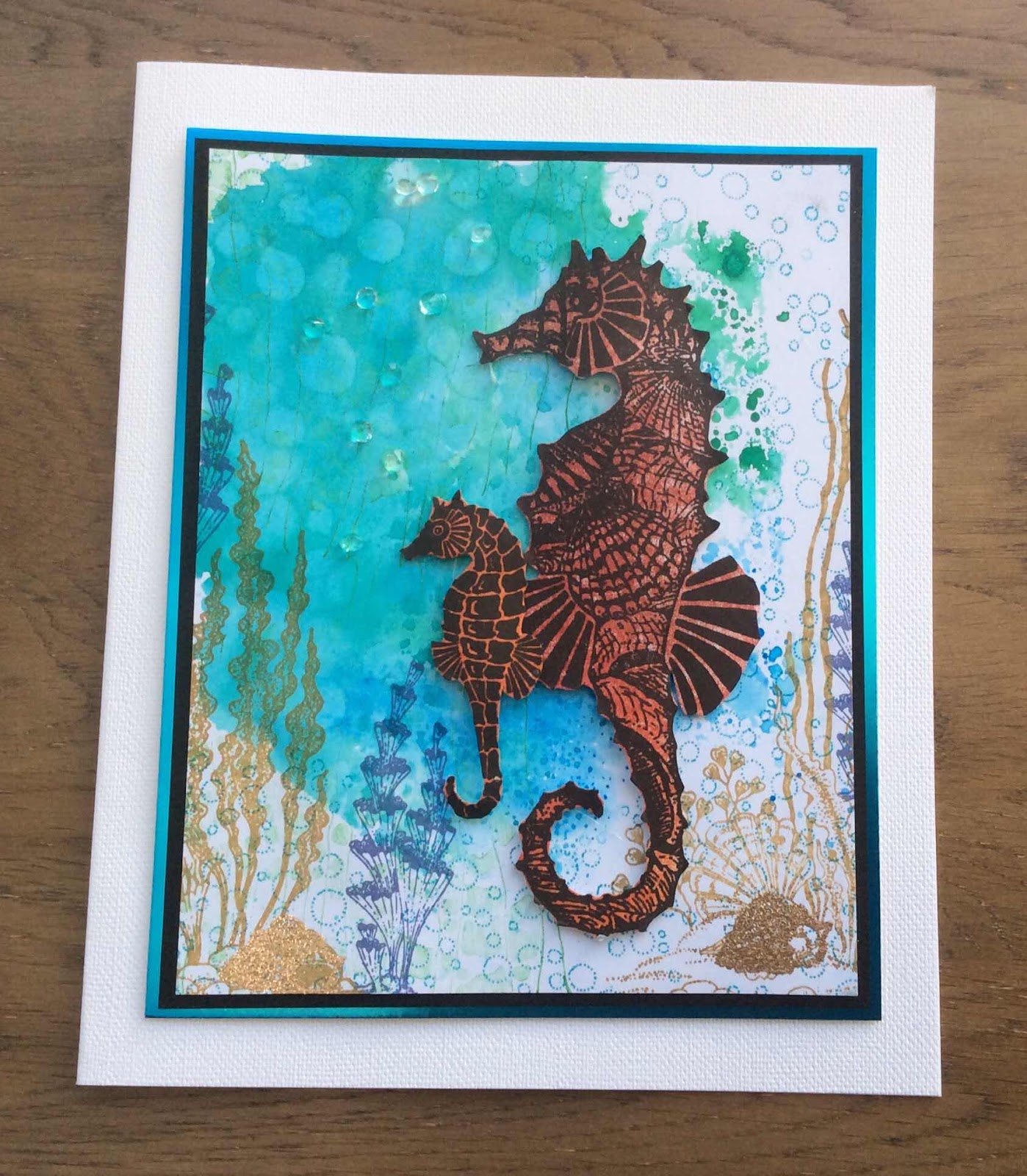
Hello, I am sharing some more of my cards made for the June show on The Craft Store.
The stamps I have used are Steampunk Butterfly and Punky Romance.
For my first card I made a background using watered down blue and brown distress inks onto watercolour cardstock. When it was dry I used the same inks and stamped the cogs from Steampunk Butterfly randomly. I stamped the corners and the bat wings in black archival ink and coloured with a darker blue. I finished the card by adding the sentiment, some pen nibs that I cut on my silhouette and a few small bats* from the Nevermore stamp set.
*The small bats were also included in last years Comfy Pyjama Online Retreat which was absolutely fabulous and it's happening again this year!

I stamped with archival ink, then used pencils to colour. Once it was all coloured I used a blending solution to soften the edges of the pencils. I added the sentiment from Punky Expressions.


Sandra x
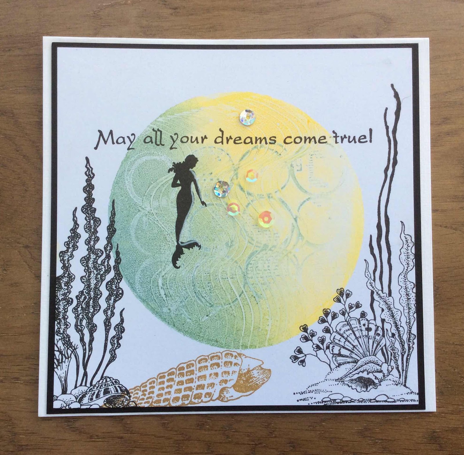
Hello, Doreen O'Brien here, back with another blog post to share with you.
I first cut an oval to use as an aperture for my card. I inked the background with Distress ink and then inked over a stencil. I stamped my images from the Mermaid Queen set and coloured them with Distress inks. The sentiment was stamped onto card and attached with foam pads.

Bye for now.
Doreen
Punky Posy
Hello all Chocolate Baroquers, I'm back for my second visit this month. I would like to share this Steampunk floral tag with you today.


Morning Peeps thank you for stopping by.
Another card for you today again from the recent Chocolate Baroque TV show.
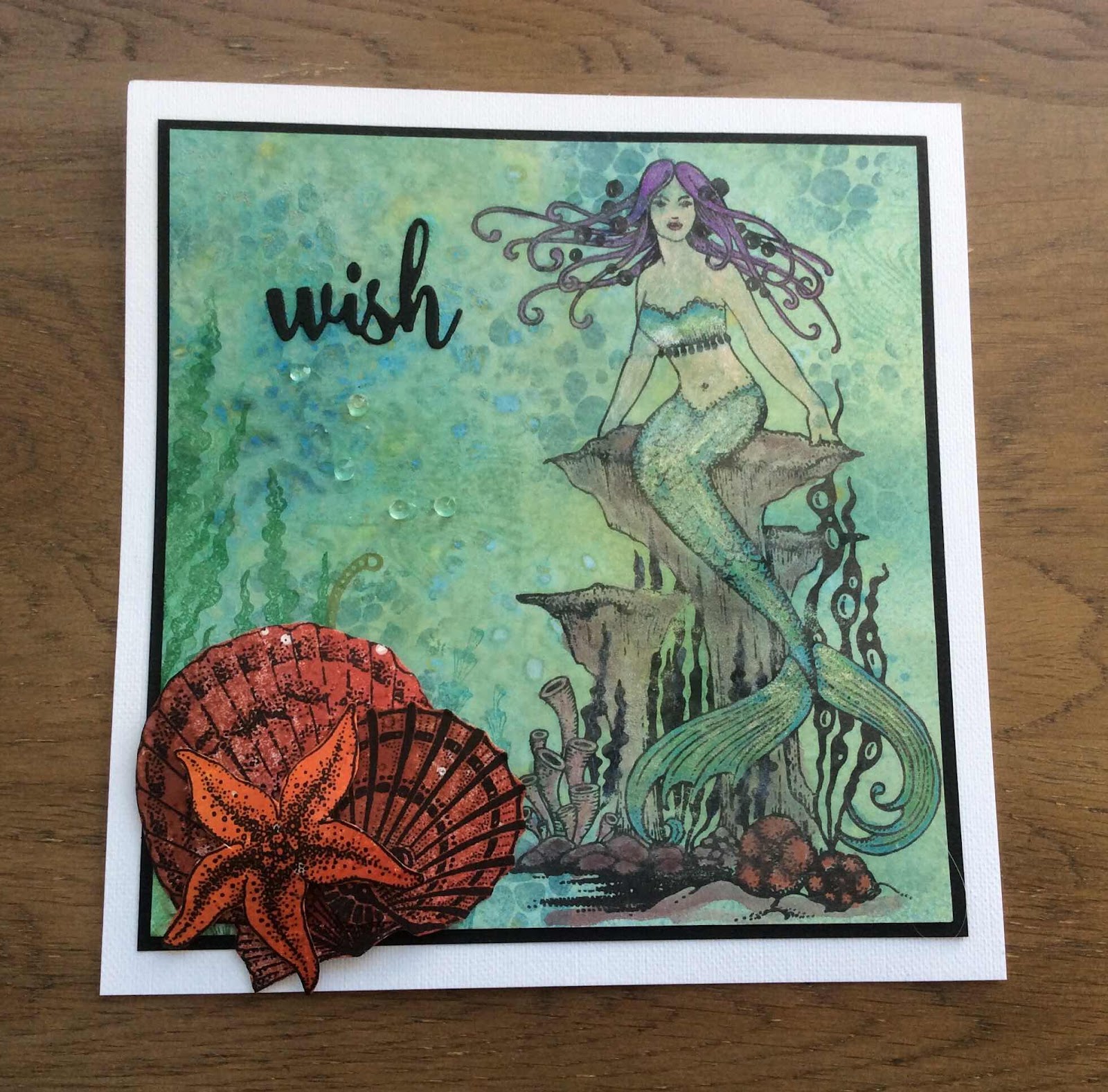
This time I will be using the Mermaid Queen stamp set.
Take an A5 piece of card and trim 2cm from one long and one short edge.
Using Broken China, Salty Ocean and Salvaged Patina Oxides and a stencil cover the card. If you don't have a stencil, use your paintbrush and paint thick and thin lines. Matt and layer on to blue card. Leave to one side.
Take a piece of card big enough for the mermaid stamp and stamp in Momento London Fog, tear the edges.
Stamp the image again on to a scrap piece of card.
With the second image colour the tail and bra using the Artway shimmer paints, cut out and put to one side.
With your main image colour the mermaid using alcohol markers and also the coral and seaweed.
Dab Distress ink pad (not Oxides) in Broken China on to acrylic block and with a water brush apply colour to the background of the mermaid.
Take the same ink pad and go around the torn edges.
Cut out the bra and tail from the second image. If you look at the stamp at the bottom, I left the two 'fins' either side of the tail, and just cut the V shape and up to her waist. Stick on to the main image using foam pads or gel glue.
Go around the torn edge with Broken China. Attach to the main panel.
Apply gems to hair, belly button, and four corners.
Job done.


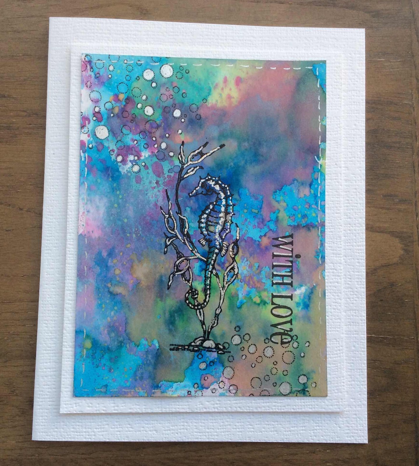
Hello everyone, I have a couple of projects to share with you using stamps that were featured on last month's TV shows.
My first project was created using a stencilled background and three different colours of Distress Ink. I used a piece of Smooth White Stamping Paper and moved the stencil across the page to cover the entire area. If you look closely, you can see where I have joined the two sections together, but it doesn't really matter, as it is just a background, and the butterflies from the Steampunk Butterfly stamp set mostly cover it up.
I chose three words from the Punky Expressions stamp set, and stamped them onto the background using Versafine Black ink. I stamped the butterflies onto some Drawing Cartridge using the same ink, and coloured them with Inktense pencils, blending the colours with a waterbrush. Any watercolour pencils would do. I cut the wings out and adhered them either side of the words. Finally, I added the sentiment, also from Punky Expressions.

For my second card, I created a background using a piece of Drawing Cartridge and Distress Inks in shades of brown and green. I added stamps from Make Your Mark, Timeless and Steampunk Butterfly. I stamped and embossed two butterflies from the last set using copper embossing powder, and coloured them with Inktense pencils and a waterbrush, again, you could use any watercolour pencils. I cut the butterflies out and added words from Punky Expressions. I edged the background using a dark brown ink.

I had a lot of fun creating these cards, the stamp sets are so versatile, and as you can see, they all mix and match so well. I hope that I have inspired you to try out some ideas. Thanks for stopping by, take care,
Judith xx
Hello everyone, our Guest Design Team member Natalie is back with another step by step project for you today.

The process for this card may seem backwards to how most techniques are taught, but this is all about controlling placement of colour. This is a good method to work with whenever you are working with complementary colours or mixes where it is possible to create mud if the wrong colours touch.
You will need:
Initial stamping
Starting with your focal image from Mackintosh Beauty, stamp it in your water resistant ink onto the watercolour card. It is important that the image won't smudge or bleed when water is applied; so if you are unsure, do a swatch test first on a spare piece of the same card.
Next we are going to stamp the background. Now, this may seem a little back to front, but doing it this way means we can plan our texture stamps easier. The first image to stamp is the text stamp from Make Your Mark using the Pumice Stone ink. Place this stamp to the bottom left of your main image so that it overlaps the design without overlapping the main flower. Using the brushstroke from Just Useful and the Kitsch Flamingo ink, stamp this image horizontally across the top of your focal image. You may not need to ink the whole image, I only stamped about 2/3 of the stamp and faded it out on the right hand edge. As this is a solid image, you may find the Distress Ink puddles a little; that's OK just blend it left to right with a blending sponge or brush.

Watercolouring the panel.
Remove the piece from your stamp platform and work on a level surface. Squidge a little of the colour Distress Inks onto a palette pad or blending mat. This is your watercolour palette, so pick up your brush and dampen it before picking up ink.
The leaf is a blend of Squeezed Lemonade and Salvaged Patina. Allow the colours to mix on your card by wetting the area with just water first then dropping in the colour. You can always add more detailed shading once this initial layer has dried.
The flowers are a blend of Squeezed Lemonade to the top of the petals blending into Kitsch Flamingo. Use the same wet in wet technique. Working with Distress Inks, or even watercolours means we keep all the amazing detail you find in Chocolate Baroque stamps.

You can then pick out areas in the background, mixing colours to create new ones. For instance, the lilac is a mix of Salvage Patina and Kitsch Flamingo.
Stencilling
This again may seem backwards, but it means you can plan your colour blends around the colouring of your image. You want your stencilling to contrast whatever it is near. Place your stencil over your panel. Mine is DL so it is easy to see my limits, but if yours is larger, you can always mask off the excess.
Blend your inks using a blending brush for a light, even coverage that really gets into the details.

Cropping and Edging
Next, you want to trim this panel so you get edge to edge coverage.
You can then use your blending brush and Salvaged Patina to darken the edge of the panel. It is little touches like this that help to frame your artwork. Try it in your other projects and you'll see the difference that it makes. Holding your brush vertically, drag it downwards against the edge of your card. You can soften the corners by slightly tipping the head as shown in the photo here.

The Background
Choose three colours that suit your panel. I used some old swatches that I've been upcycling, but offcuts are also ideal for this part of the process.
Trim the pieces to suit your design. I cut three rectangles with a width of 3 1/4" and adhered them into a strip using a wide masking tape to the reverse. I then trimmed this around the edges to tidy and cut in half vertically into two long strips.
To tie the panel back into my card base, use the Squeezed Lemonade blended across the front panel of your card blank. This is a good trick to use if your card doesn't quite match, or if you don't have a matching lemon cardstock. Adhere your strips as shown and then your panel.
The Sentiment
Stamp your sentiment in your water resistant ink. The brushstroke is then inked up with Squeezed Lemonade and lightly spritzed with water (this gives a smoother stamped image). Trim it and adhere to your card.
