Pin It button on image hover

Wednesday 30 April 2014

Guest Post: Under the Sea by Sam

When we put out our call for new Design Team members at the start of the year, we had so many fantastic entries that we really were disappointed we couldn't just take everyone. So we came up with a plan to contact some of the shortlisted people and see if they would do a guest post and today I'm delighted to introduce the first of our guest blog posts.

Our first post is Sam of A Bit of Crafty Genius so without further ado, here is Sam's wonderful sea inspired project.


Hi all, Sam here

I can't begin to tell you all how excited I was to be asked to do a guest post for Chocolate Baroque. I have been drooling over their designs for a long time, since I was introduced to them by a fellow fan. I'm sure you all are with me there, am I right?


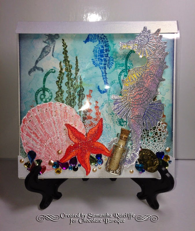
When I first received my stamps I couldn't wait to get started. I have only recently come home from holiday to Cancun and Playa del Carmen so I was in tropical mode all the way. I chose the Underwater stamp set and let me tell you, it was full of gorgeous sea elements. When I saw it, I immediately got an idea in my head and went ahead and ordered the Decorative Edges set too, for its bubbles stamp. I am so in love with the faded Harlequin stamp in that set as well, but that's another story!
 
I gathered my supplies which include Tim Holtz distress inks, markers and a waterbrush, various embossing powders, some heat-proof acetate, watercolour paper and a pre-scored pearlescent square card. I also had at hand my water spritzer with pearlescent water, my craft mat, scissors, a heat gun and embossing ink, some gems and an idea-ology glass bottle with cork.
 
I started with my card base. I knew I wanted to have an acetate front so I decided to cut an entire panel from the front of the card. I cut my acetate to size and heat embossed in white my bubbles stamp from the Decorative Edges set. I glued my acetate to the small edge I had left on the front of the card and glued a strip to the bottom of the acetate to give it a bit more stability.
 
Once my base was on its way, I chose to decorate the inside of the card rather than leave it white. I cut a piece of watercolour paper slightly smaller than my card so that I could mount it on the inside. I pressed several colours of blue distress ink on my craft mat and sprayed with my pearlescent water. This created the marbled effect that I pressed my watercolour paper into. I quickly dried my paper and then pressed it in again to give more of a splotchy look. I set this aside to dry.
 
While my background was drying I stamped and heat embossed several images from the Underwater stamp set in different coloured embossing powders. I used metallic ones, and some with sparkle, to give my underwater scene a magical quality to it. Once these were ready I fussy cut them and watercoloured with my distress inks and pens.
 
Having finished my loose elements, I went back to my marbled background and started stamping a scene to be placed behind the acetate. Unfortunately while I was doing this, I was concentrating on what would be visible on the front while the card was closed and failed to remember that the card could be opened and the inside visible on its own. This made it a little bit challenging as I now had to make sure the inside would be just as appealing without the front of the card blocking it. I had also only stamped at the middle/top of the card and the bottom of the card was rather messy. To fix this I heat embossed a mix of embossing powers to create a sandy sea bed. This completed my background which I then adhered to the inside of my card.
 
With the inside of the card finished and the acetate ready to go, I started adhering my sea elements. I found with just the 3 coloured pieces it was looking very sparse so I gathered some gems and stuck those down around the bottom, to give the illusion of treasure on the sea floor. As a final addition to my card I 'aged' a strip of paper which I rolled up and inserted into my glass bottle. I added a bit of the same 'sand' mixture into the bottle and replaced the cork. This I stuck down with glossy accents.
 
Unfortunately all of the glitter and shine of the card is hard to capture on camera (at least for us amateur photographers) so a bit of the magic was lost on film, but I assure you, it's beautiful!


Thank you for taking the time to read my ramblings and thanks to Glenda from Chocolate Baroque, I hope to see you around here again some day. And if you feel so inclined, please feel free to come visit me at my blog over at http://abitofcraftygenius.blogspot.co.uk/ 

Sam


Thanks so much Sam for a great project, we love it!  Please join me in saying a big thanks to Sam by leaving her a comment, I'm sure she would appreciate it!

Tuesday 29 April 2014

Nouveau Birds (by Asha)

Hello everyone! Have you see the stunning stamps from the fabulous new release? Don't let the art nouveau look intimidate you. You don't need to understand the design of the period to work these images. I speak from personal experience! Today I have 2 samples to show you, both made using the new A5 sets called Fleurs Nouveau.

*********

My first card is simple with neutral base colours to showcase the lovely birds from the Fleurs Nouveau set. I started by stamping a background design using one of the accent stamps from this set. The sentiment is from Loving Sentiments and I finished the card with a few simple embellishments: tiny pearls and sheer ribbon. The clean straight lines and symmetry of the layout give the illusion of Art Deco ... or not!

Here's a closer look at those magnificent birds, coloured with alcohol markers. I also added some glitter on the birds for a touch of glamour.


*********

My second card features one of the solid stamps from Fleurs Nouveau. This design too cannot be dated to any era. I started off by blending a few Distress inks, getting lighter toward the middle of the card. To frame the focal image, I stamped little grasses from the Wild Meadow set. A greeting from Birthday Words, few random placed tiny bling and the card is done. So simple and easily adaptable to any occasion.

For textural interest, I heat embossed the focal image in black. The little butterfly is from the Wild Meadow set and I added some white dots with a gel pen.


You don't have to be arty to play with these new period themed stamps. They are so versatile that you can dress them up (or down) to suit any occasion in any era. Come back soon because the rest of the DT have some more super stunning ideas to show you.

Beijinhos,
Asha

Monday 28 April 2014

Ladies in Green (posted by Judith)

Hi Folks, I have some samples to show you using the Fabulous Flappers stamp set today. I have really enjoyed working with these lovely stamps, as I am a real fan of the Art Deco/Art Noveau era.

For my first card, I have created a marble background, using shaving foam and Golden acrylic paints. I have stamped the main image onto a piece of white card, and cut out an oval shape, just avoiding the bottom area where her dress overlaps the edge. I hand cut a black mat layer. I stamped some of the flower images onto some spare white card, and coloured all of the images with Distress Markers.

My second lady is resting on a stepper card. I have embossed some linen card, and highlighted the raised areas to show the texture. I have used one of the smaller stamps on the Nouveau Lovebirds stamp plate to create a border along the bottom of the card, and added some black gems for decoration. I have added a sentiment from the Mackintosh Sentiments clear stamp set.

My last sample uses the same lady again, but this time I have used a peacock theme for my card. I created a Distress Ink background, and used a peacock feather mask over the background. I stamped the peacock cluster stamp around the edges, using the corresponding colour inks that I used to create the background.

I stamped the central image, and then used some bleach to take away the colour within the image, before colouring it with pencils. I added some ribbon, and die cuts to finish.

Thanks for stopping by, Judith xx

Sunday 27 April 2014

New flapper Girls !!!(posted by Maria)


Hello Everyone,

I wanted to show you how beautiful these new ladies are for making feminine tags!! I used some distress ink  for the background , I coloured them  with copics (of course you can colour them with pencils too!) , at the corners I used the fragment stamps  of CB and coloured them with my panpastels - gold and copper. I love these panpastels to give a finishing touch to my cards, they look so elegant with this, don't they!!

Have a nice day!!
Greetings
Maria

Saturday 26 April 2014

Chique nouveau flowers by Miranda


Hello there,

There are some lovely new Art Nouveau stamps released at Chocolate Baroque! I did have a play with the Nouveau lovebirds and deceide to keep this card simple ( not really CAS) but chique. I have embossed the stylish flower with WOW Vanilla white and just sponged over it with some brown pigment inks. When I finished that I just wiped over it with a soft towel to wipe off the ink residu of the embossed layers.
The text is from the Mackintosh sentiments, a type of font witch matches perfect with this style of stamps.


Hope you like these stamps as much as I do! They are a great match with the the other new sheets and some older sheets which you will recognize in other beautiful samples the designteam has made. Keep an eye on this blog for the coming period because lots of artwork with these beautiful stamps will be shown here made by a talented bunch of ladies!


Thanks for visiting and hope to see you next time!
Please ask when you have questions about my cards, I will be happy to answer......


Friday 25 April 2014

All dressed up (posted by Claire)

Good morning Claire here with my first sample using this months new stamps Fabulous Flappers (you can find them here). I've had a wonderful time with them as they are such versatile stamps, great for lots of different techniques from colouring to paper piecing to dusting off the angelina fibres to create outfits for these lovely ladies.


I've coloured this glamorous lady with my Graph'It markers and added some faux pearls to her collar and her hair. I've lightly distressed the edges with Black Soot distress ink.


The background was made using Ladybug memento ink and one of the stamps from Fancy Flourishes, these are clear stamps which are perfect for pattern building. Again I've distressed the edges with a little black soot. I've added some black lace, red ribbon and a little resin flower. the sentiment is from Mackintosh sentiments

Thanks for visiting today, keep popping back as my teamies have got some really beautiful projects to share using this months gorgeous new stamps
Claire xx

Thursday 24 April 2014

FABulous new stamps Dahling!


I know there's still a week to go, but we're launching our May stamp of the month today, Fabulous Flappers as well as two gorgeous Art Nouveau inspired sets too.

Meet the Fabulous Flappers - they come as an A4 set:

http://www.chocolatebaroque.com/Fabulous-Flappers-Unmounted-Rubber-stamp-sheet--A4_p_6039.html

then we have Fleurs Nouveau

http://www.chocolatebaroque.com/Fleurs-Nouveau-Unmounted-Rubber-stamp-sheet--A5_p_6040.html
and Nouveau Lovebirds

http://www.chocolatebaroque.com/Nouveau-Lovebirds-Unmounted-Rubber-stamp-sheet--A5_p_6041.html

Apologies to anyone French at this point for savaging your language.  I'm pretty sure fleurs are feminine (not to mention plural) and the pairing with nouveau is no doubt causing some hands to be thrown up in horror, but I'll claim artistic license - it's simply a reference to the Art Nouveau style. 

As always, we have put them on the website at introductory prices until the end of May, and there is a multi-buy for the two Nouveau sets as well.

http://www.chocolatebaroque.com/Fleurs-NouveauNouveau-Lovebirds-Unmounted-Rubber-stamps-Multi-buy--A5_p_6078.html

The girls start blogging artwork with these stamps from tomorrow, so you're in for a real treat. 

If you're new to the blog, you might be interested to know that each month we give away a Chocolate Baroque gift voucher to one person drawn from all the commenters, so it's always worth leaving a little message of appreciation or encouragement.  Shirley will be announcing the winner in the first week or so of May.

The image you saw at the start is a work in progress.  I've coloured each lady using watercolour and a touch of coloured pencil, but they're currently sitting on my craft table waiting for assembly into some kind of seasonal project.  I'm still not entirely sure what, but I coloured them to represent Spring, Summer, Autumn and Winter, so I'm thinking about some kind of book maybe.  Click on the image for a closer look.

Have a great weekend and watch out for some great guest posts coming up later this month.


Wednesday 23 April 2014

Elegant edges by Miranda


Hi there,


I've made 3 cards using the lovely Elegant Edges from Chocolate Baroque combined with some other sheets. The first one is made using the Gingko leaf border and the separate stamp of the Gingko leaf. I've made this one in green with gold shades. With all tree cards I' ve used my favorite technique with the acrylic bloc and Distress inks. Did some partial gold embossing and some white embossing on the little rectangle. I've used the text from the Elegant Crocus sheet. I've embossed the little gingko leaf with gold and decoupaged it.


The second one has been done with the honeysuckle border and the main image is from the  Fragrant Honeysuckle sheet from CB. Coloured with waterbased markers in matching colours. I've embossed the card partially with an embossingfolder and added some Inca Gold wax over it. The text is from the Loving sentiments.


And finally the third one with an unusual colourscheme for me......using the Primula edge and some stamps from the Elegant Spring flowers. A lot of decoupaging and the text is from the Fairyland words. I've used waterbased 
markers and colour pencils to colour the images.


And finally I've made some smaller cards with the left over cardstock and stamped images.......no need to waste them mmm?

Here they are......


Well, hope to have given you some inspiration with these edges, they are great to combine with some of the other older sheets from CB.
If you have any questions about these, please ask and I am happy to explain.


Thanks for visiting and I always enjoy to read your comments, till next time and enjoy stamping!


Tuesday 22 April 2014

Magic Happens (posted by Claire)

Good morning, I hope you've all enjoyed the Easter Weekend. It seems to have gone so quickly but although Easter is over Spring is well and truly here and the Springtime Edges stamps are perfect for so many different projects.   I've used them with one of the beautiful Spring Fairies for this card she is from the March set


I began by stamping the fairy with Memento Tuxedo Black ink and masked her with Masking Tissue to stamp the lovely primrose edge in the background (this time I used Memento Bamboo leaves). I left the mask in place while I created the background. Using PanPastels I added some shades of green to the foreground of the scene and then took shades of Yellow to create a sunny effect behind the image. I sealed the PanPastels with hairspray and used distress inks through the Lucious Leaves Dylusions stencil. I removed the mask and coloured the fairy and the primrose edges with Graph'It Markers. To finish off I added some tiny die cut flowers and stamped the sentiment which is from Fairyland Words.

Thanks for visiting today
Claire xx

Monday 21 April 2014

Patchwork Landscape - By Florence

Hi everyone

I have had so much fun using the Patchwork Landscape stamps.

Here are a few cards that I would like to share with you all.  I hope you like them.


For my first card all I have done is stamp the image, using black Staz-On, onto white coated card stock and colored the image using felt pens.  I then just mat and layered.


For my second card,  I had in my mind just neutral colors.  I wanted to use the new Cornflower Blue Archival ink which is a more bluish grey in real life.  Love this color.  Please click on the link to see the other colors in the range.

Again, this is a really simple card.  I stamped my tree onto white coated card stock.  I then stamped around the edge of the card using Pumice distressing ink and one of the background stamps from Abstract Fragments.  

I added some postal marks using a stamp from my own stash.

I then just mat and layered using some pretty papers.


I really enjoyed making the third card.  It started out as a bit of an experiment.  As soon as I started using the Patchwork Landscape stamps I did have it in my mind that they could be used for creating patchwork patterns and backgrounds so I thought a patchwork Rooster would be fun.


I cut the Rooster out of coated card stock.  I used a die but there are plenty of free templates on the web.

 I used the tree stamp from the center of the stamp sheet for this card.

I made three masks of just the top of the tree.  To make the masks, all I did was to stamp the image three separate times onto masking tape and then cut them out.

I then stamped randomly, using black Staz-On, over the Rooster shape.  Each time I stamped I covered the stamped image with a mask until I had covered the whole of the Rooster.

When the ink was dry, I colored in the stamped images with felt pens and applied just a hint of Black Soot distressing ink to the edges of the shape of the Rooster using some Cut n Dry Foam.

The Rooster's head is in two pieces.  I colored the comb red and then colored the main piece using Broken China distressing ink and a piece of Cut n Dry Foam.  When the ink was dry I stamped the script (from the Antiquities Stamp Sheet) using black Staz-On.  I also edged this with some black distressing ink.

I then just mat and layered the piece of the Rooster and mounted it onto some pretty papers.

That's all from me today.  Thank you for your company.

Happy Stamping
Florence x

Sunday 20 April 2014

Inspired Flowers (by Debbie)

 
We take inspiration for making art from many places and this card was inspired by Moorcroft Pottery that Florence from the Team had pinned on Pinterest. I have a Moorcroft piece that belonged to my Mum but unfortunately the family don't like it so it's carefully packed away.
 
I started with black card rubbing it with an anti static bag and then stamped the flower border with Versamark Ink and heat embossed with Gold powder. I repeated with the smaller flowers from the set. The flowers and leaves were coloured with Twinkling H2Os and against the black card the colours really shine. I cut a tag and added a sentiment then stamped around the edges of it. The ribbon is used sparingly as it's one of my favourites and matches the purple card well.
 
Thanks for stopping by
Debbie

Saturday 19 April 2014

On Top of the World by Doreen

Hello to you all, Doreen here, I am sharing a card I have made using the Patchwork Landscape stamp sheet 


I first stamped my image using black Versafine ink  and after colouring with watercolour pencils,I then masked off the image and  made my background  by sponging with Faded Jeans and Festive Berries distress inks. The backing card has been stamped all over with one of the smaller flower stamps.using Faded Jeans Distress ink. and then matted this onto a dark blue card.

Friday 18 April 2014

Whimsical Patchwork Trees and Flowers (posted by Shirley)

Hello everyone, I hope your day is going well.

I have two designs today featuring stamps from the wonderful and whimsical Patchwork Landscape.   I love this stamp set :)  Yes I know I say that a lot, but it's true.


I blended Mustard Seed and Peacock Feathers Distress Inks using ripped cardstock as a mask to create the background.   I also used a piece of cardstock with a circle and Picked Raspberry Distress Ink to create the sun.    I stamped a fragment from Textured Fragments in some areas of the ground.   The patchwork tree was stamped with Cobalt Archival Ink and coloured with Distress Inks, water and brush (on my craft mat).   'Just to Say' is from Mackintosh Words.

The die cut flowers are by Heartfelt Creations - Vintage Floret (coloured with Mustard Seed and highlighted with Peacock Feathers Distress Inks) and the Pine leaf is a McGill punch. 

This second design is CAS created with circles cut into card stock.


I used Mowed Lawn, Peacock Feathers & Picked Raspberry Distress Inks blended over the circles.  The stamping again is with Cobalt Archival Ink,coloured with Distress Inks and highlighted with a white Gelly Roll pen.   'Just a Note" is from Mackintosh Words.

Thanks for your visit and have a wonderful Easter,
Shirley

Thursday 17 April 2014

Springtime Edges For Easter (by Asha)

Hello there! With Easter just around the corner, I'd like to show you two cards I made by pairing the Springtime Edges stamps with the Easter Traditions set.

On the first card, I've got the Daffodils and Snowdrops stamps from the Springtime Edges together with a cross from the Easter Traditions set; all coloured withTim Holtz Distress Inks.

By setting the solid image behind the foam-mounted cross and adding a coloured border in front, I'm creating a perception of depth and distance. 


My second Easter card features the Primula stamp from Springtime Edges with the Daffodil and sentiment from Easter Traditions.


 I've applied alcohol markers in traditional Pascal colours on the images.


I hope you're having fun playing these new stamps. The DT will be back with more exciting ideas. In the meantime, have a Sweet and Blessed Easter ... from all of us at team Chocolate Baroque.

Beijinhos,
Asha 


Wednesday 16 April 2014

Edging into Spring (posted by Judith)

Hi Folks, I hope that you are enjoying the new stamps this month, and the inspiration from my Team mates.
I have a couple of cards to show you today. My first card uses the lovely gingko leaves from the Elegant Edges stamp set. I stamped the single leaf over the background using Versamark and clear embossing powder, which I heat set. I painted the background with a water based ink, and then ironed the background placing it under some greaseproof paper to remove the embossing powder. This technique leaves a lovely smooth background.

I stamped the gingko border, and partially die cut an oval beside the border, which I coloured with Distress Ink. I coloured the leaves with Distress Markers. I added a sentiment from the Loving Sentiments stamp set. I stamped three butterflies from the Spring Fairy collection onto vellum, using white embossing powder, and coloured the reverse with permanent markers, Graph'its would be great for this technique. Finally, I coloured some seam binding with green ink, and crumpled it as I dried it, for a distressed effect.

 My next sample uses a mixture of stamps from the Patchwork Landscape stamp set and the Elegant Edges stamp set.

I have made a step card as my base and created layers of planting in front of the house, representing a cottage garden.I stamped all of the images onto cream paper, using gold embossing powder, and coloured them with Distress Markers. I added them to the various layers of the step card. You can see a more detailed explanation on My Blog


 Thanks for stopping by, Judith xx

Tuesday 15 April 2014

Elegant Edges + Patchwork Landscape stamps by Maria


Hoy everyone,

Here I made my creations with the new Patschworklandscape stamps and the Elegant Edges stamps, I have tried to match the stamps together  it was really fun to do, The edges are so elegant and give  such beautiful  detail to my cards , don't you think!!?? I hope you will try to match them too!!

Have a nice stamping time!!! and till soon!!

Greetings
Maria