Pin It button on image hover
Showing posts with label Say it Vertically. Show all posts

Wednesday, 6 July 2022

Black and Gold Christmas by Natalie


I know... I know... it's too early to be thinking about Christmas... or is it?

In June, Lesley brought the retiring stamp set to her shows on Create and Craft. This card uses a couple of these sets alongside the vertical sentiments: Say it Vertically. Vertical sentiments are great for where we need to add a vertical boundary or border.

The background design

Most of my backgrounds start life as a piece of plain white card. Using two of the larger flower gem designs, I stamped in Antique Linen and Weathered Wood Distress Oxide inks. Distress Oxides give a better impression when stamping but can also be pulled out with water. Stamp the images so they overlap and no masking is required.

As we are using white card rather than a watercolour or mixed media surface, work with a damp paintbrush rather than flooding the card with water. Start by pulling out the Weathered Wood flowers as the foreground; Antique Linen images will more easily fade into the background. Blend around the outside of the bezel (the round bit) around the gem. This will instantly give your image dimension, and you can always print with a little reinker or squidge some ink onto a palette. Blend around the outside of the flower using just water.

Colouring the gems

Treat each ring of polygons as one shape. Work a gradient across the ring dark to light; then on the next ring go light to dark. This will fake a sparkle; you can embellish with a white gel pen at the end if you wish.

Repeat this colouring process for the Antique Linen flowers but only where a Weathered Wood flower doesn't overlap.

Focal Point

Stamp two long drop baubles in Weathered Wood onto white gold mica cardstock. Allow to dry (it will take a little longer on this kind of cardstock) before fussy cutting out the images.

Crop a panel measuring 6x4" and adhere to a 6x6" black mica card blank. Trim a strip of vellum measuring 7x1.5" which will wrap vertically so you can adhere it on the inside of your card. Overlay your baubles and adhere both to the vellum and add additional adhesive beneath the vellum so it is secured.

Use a sparkly pen to draw two strings for the baubles.

Stamp your vertical sentiment onto either white card or more of the mica card. Use a more permanent ink to bring out the detail in the stamp such as a grey permanent pad.

Wednesday, 4 May 2022

blown away

For my first post this month I chose to use the lovely dandelion stamps from the Gerbera and friends stamp plate

I used a  splodgy background from a previous session, which had just the right colours. The base card blank was 7" square, and the front was cut in half - the background piece was trimmed to make 2 pieces , one to fit the half card front and a narrower one to go on the inner.

The images were stamped using a white pigment ink pad - it's a fairly new ink pad, but gives a very muted image , so once the first images were dry I stamped again and white embossed them. Narrow black mats and a sentiment from say it vertically to finish.


 I couldn't resist another candle ,  images simply stamped in black versafine ink, torn out and fused on. It would have been easier to stamp all the images onto a single piece of tissue paper rather than doing them singly as I did - you live and learn!

Sunday, 20 March 2022

Tile it With Flowers by Doreen

 Tile It With Flowers

Hello everyone, today I am sharing a simple quick make all it needs is some preparation before either going to bed or the day before making the actual card, this will give the paste time to dry properly.


To start this card I just used a background from my stash which I wiped over with an antistatic bag. I used  ' Have A Magical Day ' from the Say it Vertically stamp set of various useful sentiments. Stamped using a Versamark Inkpad and heat embossed with a Copper embossing powder.

The Mosaic Flower which I prepped the night before peeled away easily from the stamp but where I had been a bit too frugal with the paste left areas behind that hadn't fused together properly but I think it adds to the effect.
To make the image pop I used a Permanent Black Fine liner Pen.

To mount I used a silicone gel.


Thanks for looking in today 

Love Doreen


Saturday, 12 March 2022

Fabulous Flowers by Sandra


Hello everyone.
I am sharing some more of my cards from the February shows on Create and Craft.

For my first card I have stamped one of the flowers from the Glorious stamp set onto black card and embossed in Gold embossing powder. I have then coloured the flower with shimmer paints and added a border from Modern Textures and a Sentiment from Say it Vertically. I have mat and layered onto some gold card and then onto a 7x5 card base.


My next card uses the same floral image which I have stamped twice and fussy cut. I created a background from a master board I made using Distress Inks and On the Tiles, Square Bubbles and Large Crackle Background. I cut a piece down to fit onto a 7x5 card base and added the flowers on some foam pads to give some dimension. 
                                            ,

For my next card I stamped the second floral image  from the Glorious stamp set.  I coloured the flower with Distress Inks. Using the left over ink I made two little border strips and added a background using the smaller stamps from the set. I finished by adding gems and die cuts.

For my last card today I stamped the flower from Glorious in Memento Ink. I then coloured in different shades of grey alcohol markers and added corners stamps from Nature Swirls.


 Thanks for looking

Sandra x 

Thursday, 3 March 2022

One Stamp , 3 Ways by Sandra

Hello everyone, today I am sharing three of my cards from the February show on The Craft Store which is now known as Create and Craft.

I used the Mosaic Flower stamp set and it is so versatile.
Sentiments are from Say it Vertically

For my first card I have used alcohol markers and coloured some of the Mosaic background in bright, summer colours and left the flowers uncoloured. I have mat and layered onto a 7"x5" card base using coordinating colours of cardstock. Great for a birthday card.

For my second card I have used soft purple markers to colour the flowers and added some green to the background. I found this combination very peaceful and ideal for those difficult cards we have to make sometimes.  I have mat and layered onto a 7"x5" card base.


My last card today is coloured in vibrant reds, which could even be adapted to a Christmas card!

I have made this card 8"x8". By adding just a small amount of detail around the main image it makes a lovely larger card.  Detail stamp is from Modern Textures


Thank you for looking

Sandra x


Tuesday, 15 June 2021

Bottle and Jug (by Veronica)

 It's always fun to have the quirky designs by Kim Moody to play with, and this month we had four!


I have used just the old pub one here, to celebrate the hospitality reopening....

My first one used a brusho background, image stamped in black versafine and clear embossed. I used bleach to take the colour out on the plastered areas of the building and a marker pen to colopur the roof.
The sentiment is from Say it vertically.


 The second version is back to a daylight view, stmaped in black again and coloured with marker pens.The background was sponged with distress inks and stamped with the script from Scripts and timepieces

Saturday, 12 June 2021

Cloudy Skies (by Judith)

Hello everyone, here are a couple of projects that I created for last month's TV shows on The Craft Store, using the fabulous new house stamps from Kim Moody.

 I created a background using Distress Inks in shades of blue and green. I stamped Luv Shack onto a smaller piece of Drawing Cartridge and masked the image. I stamped a couple of trees from Woodland Design a Tree and extended the hedge using a fineliner pen. I coloured the background using Distress Inks and a blending brush, I used a stencil over the top with more Distress Inks to add the clouds. I added foliage to the trees and grass using stamps from Glade Design a Tree stamp set. The image was coloured with pencils. I edged both pieces of card with ink to create more definition before I adhered them to the base card. Finally, I added a sentiment from Say it Vertically.

To create my second card, I chose three of the houses - Luv Shack, Cotswold Stone, Urban Chic, and stamped them on a piece of Drawing Cartridge, masking them as I went along. I coloured the background with Distress Ink, and coloured the images with pencils. I added a sentiment from Amazing Mackintosh Words. I stamped some foliage from Silhouette Grasses along the front.


I will be back later in the month with another project to share with you. Take care and stay safe,

Judith xx

Monday, 24 May 2021

retro notelets


I created two sheets of background card using my craft mat, peeled paint and broken china distress inks and a waterspray. 


I cut pieces to ft the small 4x4" notelet cards and also a larger piece to fit the 6x6" card blank I used as the base for the wallet.

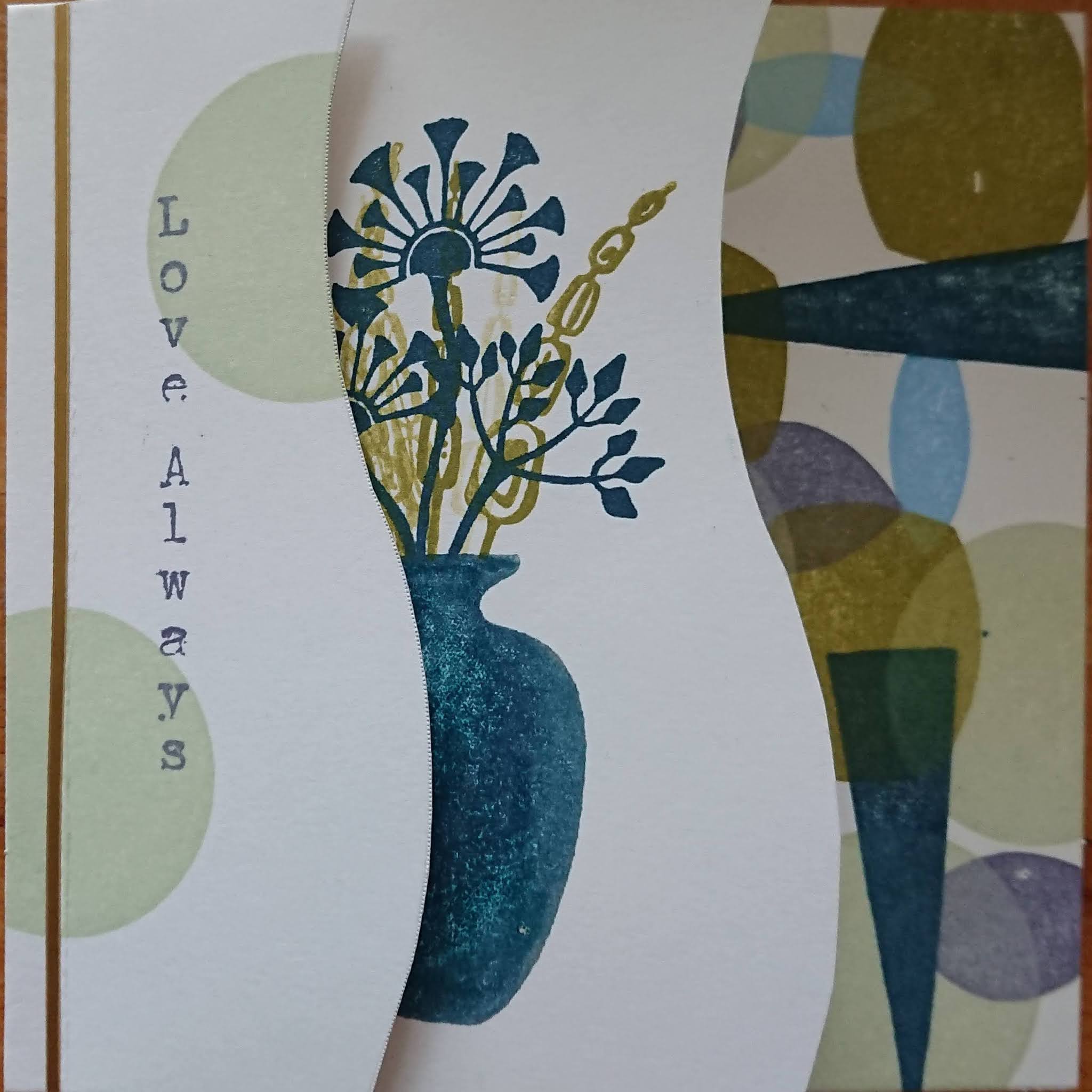
I stamped different flower images from the retro sets  onto the notelets, and also one onto the larger piece along with the sentiment from say it vertically


I also made some tags using the same stamps and sponged and stamped backgrounds and sentiments from Life is so much Better


Sunday, 23 May 2021

Groovy!

 Hello

I'm sharing more of my samples from the April show on The Craft Store

These cards feature the Retro Florals and Retro Vases.  If you were lucky enough to get these stamps you will know that there were over 100 stamps! The stamp sheets were filled with flowers, leaves, vases and geometric shapes. Lots of cutting out, but worth it. I've also added sentiments from Life is So Much Better and Say it Vertically.


For this card I first created a background by blending dye inks. I then stamped some circles and over stamped with flowers in a contrasting colour.


For this card I used a 6x6 card base. I then cut a 6x6 panel and used  Chocolate Baroque Draw and Tear Rulers to make the decorative edges. (I used the rulers to draw a line approx a third of the way in. I cut along the line  and used these two pieces as "pages" for the front of my card.) I decorated each piece with the shapes, the vase and flowers and a sentiment before assembling the card


This very simple, but effective card is made by using the different sized circles from the sets and stamping in Oxide inks. 


For my next card I stamped the trio of flowers and added some leaves. I then die cut a window box for them. I pierced a few holes on the bottom corner to give a little detail whilst still keeping the card clean and simple.


Next, I masked off an area on my card blank and blended some dye inks. I used the same colour to stamp some circles. I removed the mask and stamped the vase and stem. I decorated the vase with one of the stamps also in the set and added some white pen for a highlight. I added a sentiment and a couple of butterflies to finish.


For my last card I inked up the vase in light blue archival ink and added a darker shade to one edge to give some dimension.  I added the leaves, a couple of butterflies and a bit of shading under the vases to ground them.


I really enjoyed these Retro stamps.....can you tell? Hopefully I have given you some inspiration.

Sandra xx

Wednesday, 19 May 2021

More Masculine Cards (by Lesley Ebdon)

Hello everyone, Lesley is back with two more beautiful cards to inspire you this week. She wanted to create cards that are not necessarily using traditional male colours, or dark and sport themed. She has chosen images to suit the personalities of her recipients, and the second card is a reminder that Spring is here and the trees are turning beautiful shades of green.

This is what she had to say about appearing on the Design Team blog once again:

Hello everyone,

I was delighted to be asked recently if I would like to do a guest spot on the blog joining so many talented crafters, some of whom have been friends for many years. It's a bit like coming home lol, and it's lovely to be here again. 

This first card was for my Brother who was a draughtsman before he retired, drawing industrial buildings, so Lesley's Wild Cornflower Blueprint was the perfect image for his card. I did some blended stencilling in the background then stamped the main image using Morning Mist VersaClair ink. I used Distress Inks picked up from my craft mat to watercolour the image. I then stamped the building plan onto my card base using a blue VersaClair, matted the topper onto black card and adhered it to the card base. Finally I stamped the sentiment from the recently released Say It Vertically stamp set.


The second card was for my Hubby. 


Again I did some soft stencilling top right and bottom left using Distress Inks onto the base card, and then used the lovely little foliage stamp from my chosen stamp set with first and second generation stamping in the top right corner. I then masked off a narrow border round a piece of card for a topper and softly blended Distress Inks to give an impression of an early morning sunrise. I inked up the image from the Tall Trees set using brush pens so that I could get the variation of shading to the foliage and stamped it onto the topper, grounding it a bit with a little more ink, and added the topper to the base card with foam pads. Finally I stamped the sentiment direct to the card (I like to risk all on the last bit, lol) again from Say It Vertically.

Thank you for your visit. I hope you enjoyed my creations as much as I enjoyed making them and that you might use some less traditional male images and colours for some cards for the men in your life once in a while.

Stay safe and I'll see you again soon.

Lesley xx


Friday, 14 May 2021

past times (by Veronica)

Today I have samples using the Timeless and Scripts and Timepieces stamp sets. - anything with script images is right up my street, so i loved these.

My first sample  used the Scripts and Timepieces along with a window stamp from Gothic Fragments in the background. The background panel was inked with distress inks and stamped the large script and the window using the same inks.

I stamped the script panel on a separate piece of white card using a stamping platform. I inked the stamp up using the Koh-i-Noor marker pens , using the red pen for the initial flourish and odd words in the the script and black for the rest. Once it was dry I cleaned the stamp then inked the initial flourish using a versamark pen and stamped again - the stamping  platform meant that it lined up beautifully - then embossed in gold.  I tore the image out then inked round the edges before curling it up and  over to look like a scroll and gluing onto the   background.


 The Timeless set for the second card, stamped twice onto white card in black and once in versamark and gold embossed. One black image was overstamped  and gold embossed using a versamark pen and coloured with distress inks. Watch faces were cut out of the other images and decoupaged onto the main image, which was ddded to a distress ink background. The sentiment is from Say it Vertically 

Tuesday, 11 May 2021

Setting the Scene (by Judith)

Hello everyone, I hope that you are all keeping well. I am sharing more projects today from last month's TV shows on the Craft Store, where we showcased the fabulous Retro Vases and Retro Floral stamps. As I mentioned in my last post, if you would like these stamps, you can give Lesley or David a call at the unit, and they will take an order from you, as these stamps are not available on the website.

I decided to create a little scene for my first card. I used some torn strips of paper to create some hills, using Distress Ink and a blending brush. I added a circle mask to create a sun. Once the background was created, I chose some suitable silhouette stamps from the two sets and stamped those using various colours from the Versafine Clair range of inkpads. I used first and second generation stamping to create some depth to the foliage. The little butterfly stamp comes from the Butterfly Blush stamp set, so useful for this kind of scene. The sentiment comes from the Life is so much Better stamp set.

My next two cards followed the same basic principles, I used a piece of fabric and stamped circles in analogous colours, (next to each other on the colour wheel), using different sized circle stamps from the sets and coloured Archival ink. I then chose some of the retro images and stamped over the top using black Archival ink.

For this first card, I used an inky plate background.

For the second card, I used a Brusho background. Matting the layers onto black card adds more definition. The sentiments are from the Say it Vertically stamp set.

My final card was a quick card created straight onto a card blank. I stamped three vases using Versafine Clair ink, which I masked with Masking Tissue. I then coloured the floral staps with brush pens and stamped them above the vases, before removing the masks. I added a bit of shading with a grey pencil to 'ground' the vases.

I really had a lot of fun working with these stamps, and hope that you have found some inspiration in my projects. Thanks for stopping by, take care,


Judith xx 

Tuesday, 20 April 2021

Live, Laugh, Dream by Brenda


Brenda here again for more shares of work from last months Hochanda shows. 

I went for a bit of bold contrast with the above creation using Flora Musica stamped onto an oval and coloured in with Koh-i-Noor paints and placed over the edge of a card. The border to the left is from Harlequin Rose, a strip of red ribbon to carry the colour of the blooms and a sentiment from my Life is so much Better inspirational quote set which featured in the show.


I have used one of Lesley's new Say it Vertically sentiment sets down the side of this one and Landscape Collage stamped in black and colour added just to the sun with matting and layering to carry that colour.

May thanks for your kind visits and words of encouragement.

Saturday, 17 April 2021

flower power (by Veronica)

One of my favourite stamps was in the shows last month, the lovely flora musica and i have two versions to share today. The first is a very CAS card, simply stamped onto a  square of white card. The stamp was inked with distress marker pens and stamped using a stamping platform. I used a damp brush to draw the cololur out into the flowers and leaves and stamped the sentiment from birthday words in the bottom corner. The card was edged with ablack marker pen before mounting onto a white card blank.
The second version was again stamped using marker pens, this time edged with distress ink and mounted onto a dark red car. The background panel was sponged with matching distress inks, and randomly overstamped using just the flowers and a swirly music stamp from the music fanfare set. The same sentiment was stamped onto spare card and cut out using a punch,

the next cards use the harlequin bouquet  stamp, the first stamped in grey versafine onto white card and then again using black versafine onto spare white card, The first piece of card was coloured using wild honey distress ink and water on a craft mat, and the harlequin part of the stamp stamped randomly using the same distress inkpad to create the background. The flowers and leaves on the second image were coloured with marker pens, cut out and glued over the first images.
The base card was sponged with hickory smoke distress ink, then the image stamped randomly using the wild honey distress ink
The second version is more muted, inked first with distress markers then overstamped qwith black versafine. Background card sponged with hickory smoke and a pink distress oxide 
( probably worn lipstick, but not sure!) then randomly stamped with the harlequin part of the stamp using the grey.
Sentiment from say it vertically


My final card uses the floribunda stamp, stamped in versamark onto kraft card and white embossed. I sprinkled truquoise brusho powders over the flowers and spritzed with water. Mounts were white and turquoise card onto a square card blank , and the sentiment stamped in turquoise ink onto a scrap of white card edged with the same inkpad and matted onto a scrap of kraft card


Tuesday, 13 April 2021

Blue Florals (by Judith)

Hello everyone, I hope that you are all keeping well. I have a couple of projects to share with you today featuring stamps that we brought to the TV shows last month. Both projects share a common theme, I have used blue tones to colour the flowers. You can colour the images however you like, so why not use blue, or whatever colour you prefer? You can match the colours that the recipient loves, a favourite colour scheme, or the gift that you might be giving. 

To create my first card, I created a Brusho background, using green, turquoise and purple, and once this was dry, I inked through a stencil, using the same colours of Distress Ink. I stamped a verical sentiment from the Say It Vertically stamp set over the top.

I die cut an oval and stamped and embossed the Harlequin Bouquet, using Versafine and clear embossing powder. I coloured the image with watercolour pencils and lightly blended the colours with a water brush. I edged the oval with Distress Ink.


Another Brusho background formed the basis for my second card. I stamped the Floribunda Net over the top using Versafine once more. I added some stencilling with a mesh stencil using gilding wax this time, adding a bit of subtle shimmer. I coloured the roses with pencils, and then used a glittery pen over the top for more sparkle. I used a sentiment from Life is so much Better to create a frame.

I will be back later in the month with more projects to share with you. 

Thanks for stopping by, stay safe and take care,


Judith xx