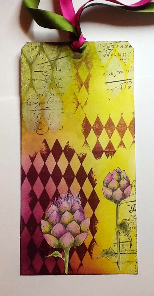
This tag started out as a three colour challenge set for me by Glenda when I was up visiting her in Scotland..She picked three colours of Distress inks for me - Seedless Preserves, Crushed Olive and Peeled Paint and I used these to colour the background on the tag. It was then left lying around for a couple of days because, although I loved the colour combination, I didn't know where I wanted to go next.
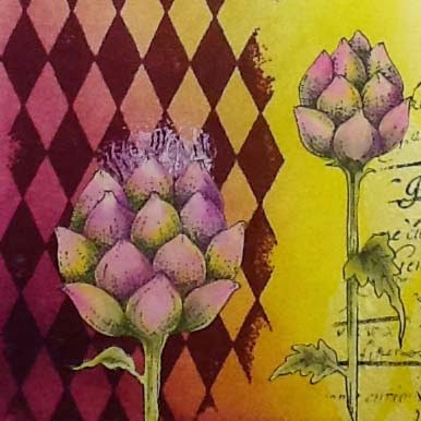
Eventually I decided to use the artichoke image from the Mellow Fruitfulness set. I stamped it onto a self-adhesive label and painted it using the same three Distress ink colours used to colour the tag.. I added some texture with soft relief paste (watch out for this product coming to the website soon) and the Blazonry stencil, then stamped over the top with a script stamp from Eccentric Edwardian.
Next I randomly stamped the image from Harlequin Fragments, and stamped the stamens of the artichoke using white paint. I cut out the artichoke images and split them up before sticking into place. Just a few scraps of toning ribbon finished it off.
Sometimes it's good to walk away from a project rather than just keep going because you feel you have to finish something. If you give yourself some space you return to it with fresh eyes and often a sudden influx of inspiration.
Thanks for joining me today and keep tuning in for some gorgeous creations from the girls with the fabulous new steampunk stamps.


Wow Lesley, these colours are gorgious , I really love this wonderful tag!!!
ReplyDeleteGreetings
Maria
These colours really work well together
ReplyDeleteYes, I love the colour combination! Gorgeous tag :-)
ReplyDeleteSally
Wow, what a beautiful stanpcombination! And great colours...
ReplyDeleteThis looks absolutely mouthwatering Lesley & the colouring of the artichoke is utterly evocative of a real one. I love the way you have the large one positioned against the harlequin background & contrast it with the smaller one against the plain/text background. The blazonry texture contrasts with the smoothness of the artichoke whilst the shape echoes it making for a tantalising design for the brain. I absolutely love the way you have the lights & darks of the whole design arranged harlequin fashion too. Your ribbons complement perfectly.
ReplyDeletePaula (PEP)
Well, the walking-away-and-thinking-about-it really worked! It's lovely :)
ReplyDeleteThis is a lovely tag Lesley and you are right walking away from something and coming back later often enables us to have fresh inspiration. It certainly worked for you with this tag
ReplyDeleteJackie x
Just beautiful
ReplyDeleteThis is really pretty and the colours work together beautifully. I love the bit of texture paste and the harlequins stencilling in the darker colour goes perfectly with the artichoke which is he same colour but watered down somewhat. The two colours of ribbon mesh in wonderfully well.
ReplyDeleteWow .. wonderful this colors you use. Greetings Janny
ReplyDelete