Here's a quick way of creating a small journal using supplies you are likely to have around the house. This technique is useful for time limited projects or where your journal theme only has a finite amount of space required.
You will need:
- Card blank measuring A5 or less (Kraft card used here) (or 2 for a thicker cover)
- A4 paper (could be copier paper, cartridge paper or more quality focussed paper such as mixed media or watercolour paper)
- Themed stamps: Making More Marks, Not More Flowers and Slim Word Strip 1
- Permanent and water reactive inks and matching watercolour pens and pencil crayons.
Making the journal
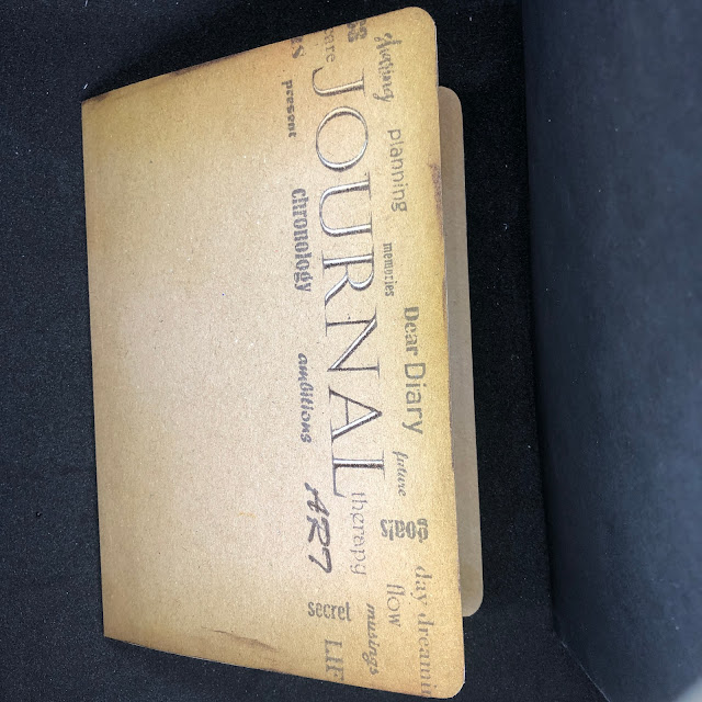
- Starting with your card blank, decorate it as the cover for your journal. Start by stamping the "Journal" stamp for Slim Word Strip 1 with a chocolate permanent ink. Use a white pencil crayon or gel pen to highlight the detail in the word Journal.
- Blend around the edges of the card blank on all sides to age the cover if you wish. I used a combination of blending brushes and sponges to vary the texture and colour depth. If you are using two card blanks, blend on the outside of your stamped cover and on the inside of the remaining card.
- Depending on your card blank size, score and trim the papers to fit inside. Optional: you can round off the corners using a corner punch if you desire.
- Next, fold your pages into one signature and fix this into the inside card of your cover (if using two) and you can even cut slots in this card for pockets if you wish. Use double sided tape to fix the card cover together. If using one card, then just staple in for the outside in.
Decorating the journal
Here's a few example pages for you along with a few little ideas along the way.
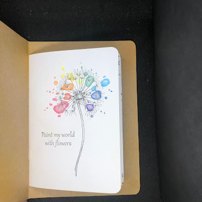
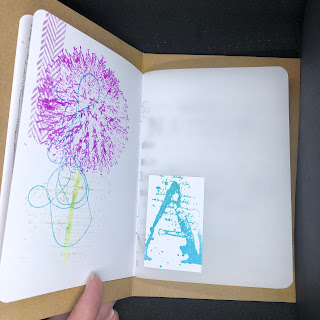
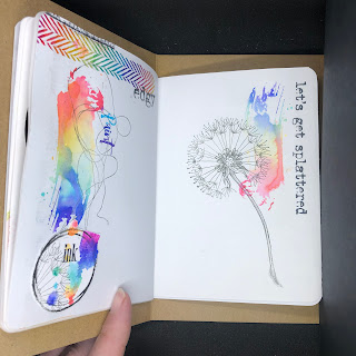
Stamped the dandelion image using permanent ink and doodled splash shapes using coloured pencils. The splurges are coloured darker on the outside to give them a wet blob appearance.
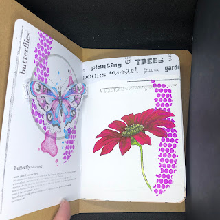
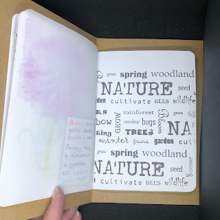
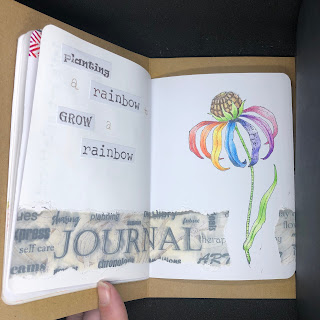
I pulled in some other stamp sets on a few pages and used masking to stamp mark images from Making More Marks into the background. The "Nature" stamp from Slim Word Strips 1 was stamped onto copier paper and torn along the long edge. It was then run through a Xyron sticker maker to turn it into washi style tape.
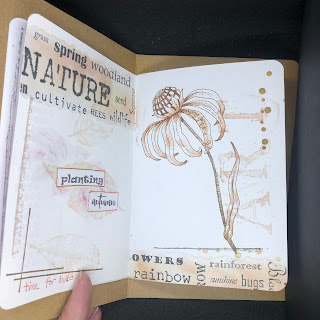
Again using the "Nature" word strip onto copier paper, but this time blend in inks into the background to add texture. Pull out individual words from the strip to use as titling or journalling.
As part of my signature, I mixed up paper types including a sheet of translucent paper as well as marker paper. Marker paper is great for avoiding bleed through, while translucent paper is great for effects such as layering and increasing contrast. You should also consider the reverse of any elements stuck to the translucent page - a great place for hiding journaling.
You can use repetitive stamping to create a background by staggering the placement of the image. I created a full sheet and then trimmed to fit my page.
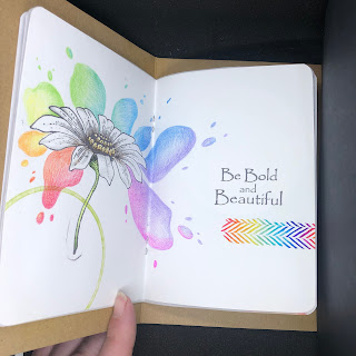
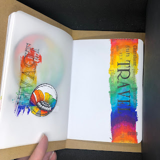
In the centre spread, I mimicked the first page this time using the daisy image; this time blending two colours per main blob. The "ribbon" stamp was stamped using a light grey ink, and then coloured using the watercolour pens to give a rainbow effect.
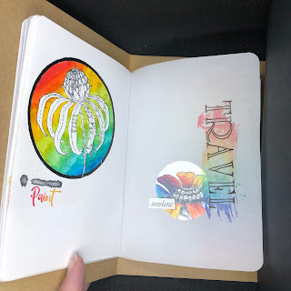
The rainbow effect for the paint splodge was done directly onto the stamp using watercolour markers and a light spritz of water to blend. It was stamped onto the reverse of the translucent paper while the text was stamped onto the front. Stamp your text first as its the bigger stamp being careful to remove any excess ink prior to stamping.
For the colour border first stamp the strip background in light grey and blend the watercolour pens for a rainbow effect. Allow to dry completely before stamping the word stamp.
In the above image, colours were applied to the paint stroke image and then prized with more water than the previous image using this technique. The colours will blend more, but be aware more warping to your paper can occur.
Multiple impressions will give you a lighter colour. I would apply these coloured images first and then align your detailed images over the top to make the most of the textures.
The border here was stamped with background strip inked first with lighter ink using kiss stamping to add the flower image into the background using a darker ink. Over this impression, then stamp your word image, this time with a water creative ink for a softer finish.

What a fabulous journal and with all those wonderful pages inside Natalie, and thank you for the step by step too. x
ReplyDelete