Hello everyone, I am sharing a few projects today showcasing the beautiful stamps that we shared on last month's TV shows on Hochanda. These lovely house stamps designed by Sue Page were such a delight to work with, and demonstrate, as always, Sue's eye for detail and her talent as a designer. We celebrated Sue's wonderful work during these shows, and she will be sadly missed. Her artwork will continue to be appreciated through your projects and creativity.
My first project is a colourful street created using the Dutch House stamp set. I stamped the image several times, masking the image to enable me to add the subsequent images slightly behind the first central image. I also added some background foliage by stamping a tree from Trees A Crowd. I coloured the background using Distress Ink, then set to colouring the houses with pencils.
For my second project, I stamped the Bridge House onto a piece of scrapbook paper using Archival Ink, and coloured it with pencils. I stamped foliage from Silhouette Grasses onto an Acrylic Tag using Archival Ink and allowed this to dry completely. I covered the paper with Matte Medium and stuck it to the tag.
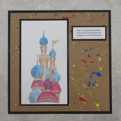
My final project was a TV demo, showing how to create a project with just three colours. I used some Koh-I-Noor acrylic paints to splatter across a piece of kraft card to create a very quick background. I then stamped the Turret House onto a piece of watercolour paper and coloured the image using the same three colours of paint; red, blue and yellow, mixing them to create orange, purple, brown and grey, by simply adding a little bit of one of the colours each time.
Thanks for stopping by,
Judith xx


Beautiful!! Love the three designs and especially the bridge house on the tag!! The splatters on the kraft background in the last card look fabulous!
ReplyDeleteLove all these projects Judith. Thank you.
ReplyDeleteTwo gorgeous cards Judith and a very pretty tag in those quite restrained colours apart from the pink foliage which looks great. The lovely row of buildings on the first card is beautiful especially with the background trees, and the last card has that wonderfully splattered background in super bright colours which work beautifully on the kraft card, and then the colours on the house which complement the background really well. This was brilliantly demo'd on one of the shows. x
ReplyDeleteVery pretty cards.
ReplyDelete