Hello everyone, our Guest Design Team member Natalie is back with another step by step project for you today.
The process for this card may seem backwards to how most techniques are taught, but this is all about controlling placement of colour. This is a good method to work with whenever you are working with complementary colours or mixes where it is possible to create mud if the wrong colours touch.
You will need:
- Chocolate Baroque stamp sets: Mackintosh Beauty, Make Your Mark, Just Useful
- Distress Inks: Pumice Stone, Squeezed Lemonade, Kitsch Flamingo, Salvaged Patina
- Water resistant ink: Squid Ink, Memento or similar in Black
- Strathmore Mixed Media or other smooth watercolour card
- Coloured card
- DL card blank
- Blending sponge and/or brushes
- Fine paint brush and water
Initial stamping
Starting with your focal image from Mackintosh Beauty, stamp it in your water resistant ink onto the watercolour card. It is important that the image won't smudge or bleed when water is applied; so if you are unsure, do a swatch test first on a spare piece of the same card.
Next we are going to stamp the background. Now, this may seem a little back to front, but doing it this way means we can plan our texture stamps easier. The first image to stamp is the text stamp from Make Your Mark using the Pumice Stone ink. Place this stamp to the bottom left of your main image so that it overlaps the design without overlapping the main flower. Using the brushstroke from Just Useful and the Kitsch Flamingo ink, stamp this image horizontally across the top of your focal image. You may not need to ink the whole image, I only stamped about 2/3 of the stamp and faded it out on the right hand edge. As this is a solid image, you may find the Distress Ink puddles a little; that's OK just blend it left to right with a blending sponge or brush.
Watercolouring the panel.
Remove the piece from your stamp platform and work on a level surface. Squidge a little of the colour Distress Inks onto a palette pad or blending mat. This is your watercolour palette, so pick up your brush and dampen it before picking up ink.
The leaf is a blend of Squeezed Lemonade and Salvaged Patina. Allow the colours to mix on your card by wetting the area with just water first then dropping in the colour. You can always add more detailed shading once this initial layer has dried.
The flowers are a blend of Squeezed Lemonade to the top of the petals blending into Kitsch Flamingo. Use the same wet in wet technique. Working with Distress Inks, or even watercolours means we keep all the amazing detail you find in Chocolate Baroque stamps.
You can then pick out areas in the background, mixing colours to create new ones. For instance, the lilac is a mix of Salvage Patina and Kitsch Flamingo.
Stencilling
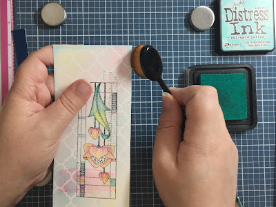
This again may seem backwards, but it means you can plan your colour blends around the colouring of your image. You want your stencilling to contrast whatever it is near. Place your stencil over your panel. Mine is DL so it is easy to see my limits, but if yours is larger, you can always mask off the excess.
Blend your inks using a blending brush for a light, even coverage that really gets into the details.
Cropping and Edging
Next, you want to trim this panel so you get edge to edge coverage.
You can then use your blending brush and Salvaged Patina to darken the edge of the panel. It is little touches like this that help to frame your artwork. Try it in your other projects and you'll see the difference that it makes. Holding your brush vertically, drag it downwards against the edge of your card. You can soften the corners by slightly tipping the head as shown in the photo here.
The Background
Choose three colours that suit your panel. I used some old swatches that I've been upcycling, but offcuts are also ideal for this part of the process.
Trim the pieces to suit your design. I cut three rectangles with a width of 3 1/4" and adhered them into a strip using a wide masking tape to the reverse. I then trimmed this around the edges to tidy and cut in half vertically into two long strips.
To tie the panel back into my card base, use the Squeezed Lemonade blended across the front panel of your card blank. This is a good trick to use if your card doesn't quite match, or if you don't have a matching lemon cardstock. Adhere your strips as shown and then your panel.
The Sentiment
Stamp your sentiment in your water resistant ink. The brushstroke is then inked up with Squeezed Lemonade and lightly spritzed with water (this gives a smoother stamped image). Trim it and adhere to your card.


Beautiful project, love how the stencilled background enhances the fabulous Mackintosh flower! Thanks for the tips.
ReplyDeleteThe Mackintosh flower is so pretty Natasha and love the colours you used and the pretty stencilled background, and the blocks of colour in the background go beautifully. x
ReplyDeleteVery pretty and I love the colour combination that you've used. Thank you for sharing how your card was made x
ReplyDelete