
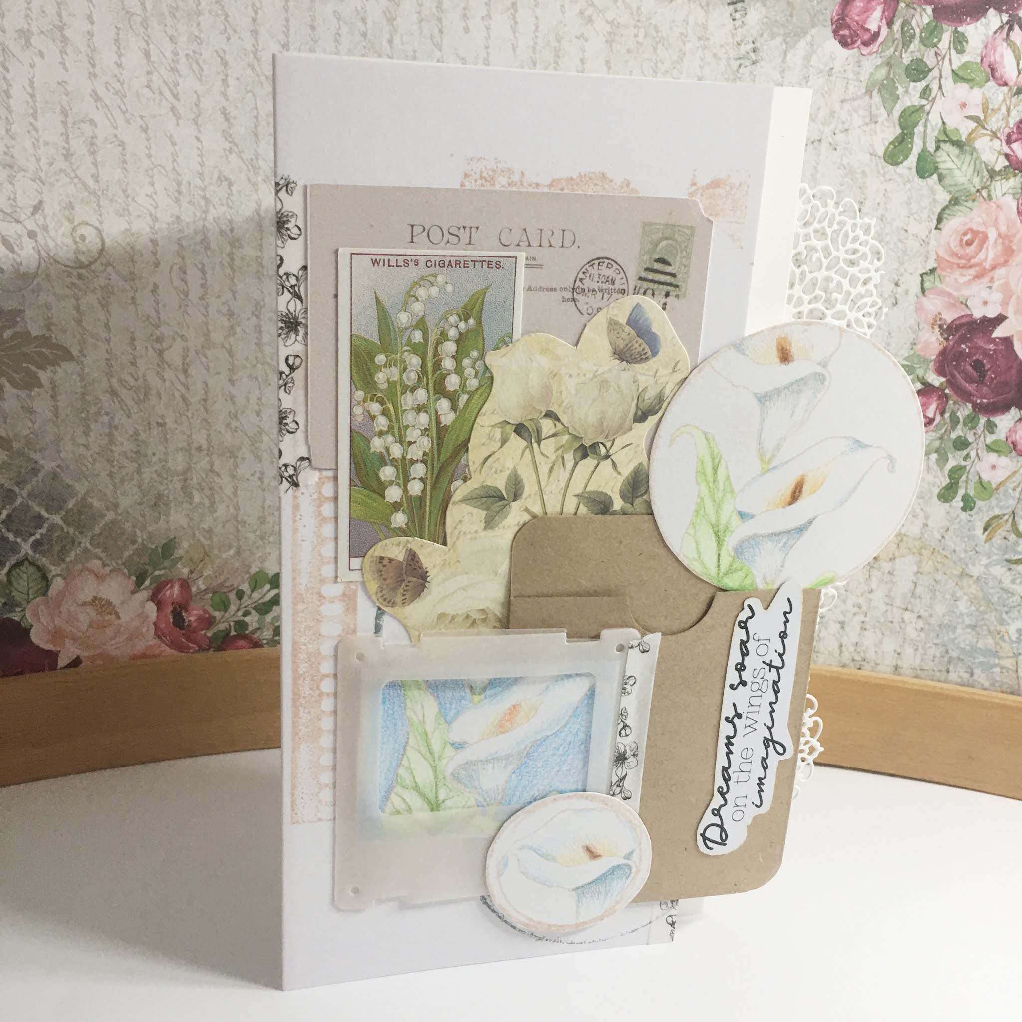
I love the look of junk journaling: vintage illustrations, centuries old ephemera and worn paper and lace. I thought I would have a go at replicating the look with my Chocolate Baroque stamps.
You will need:
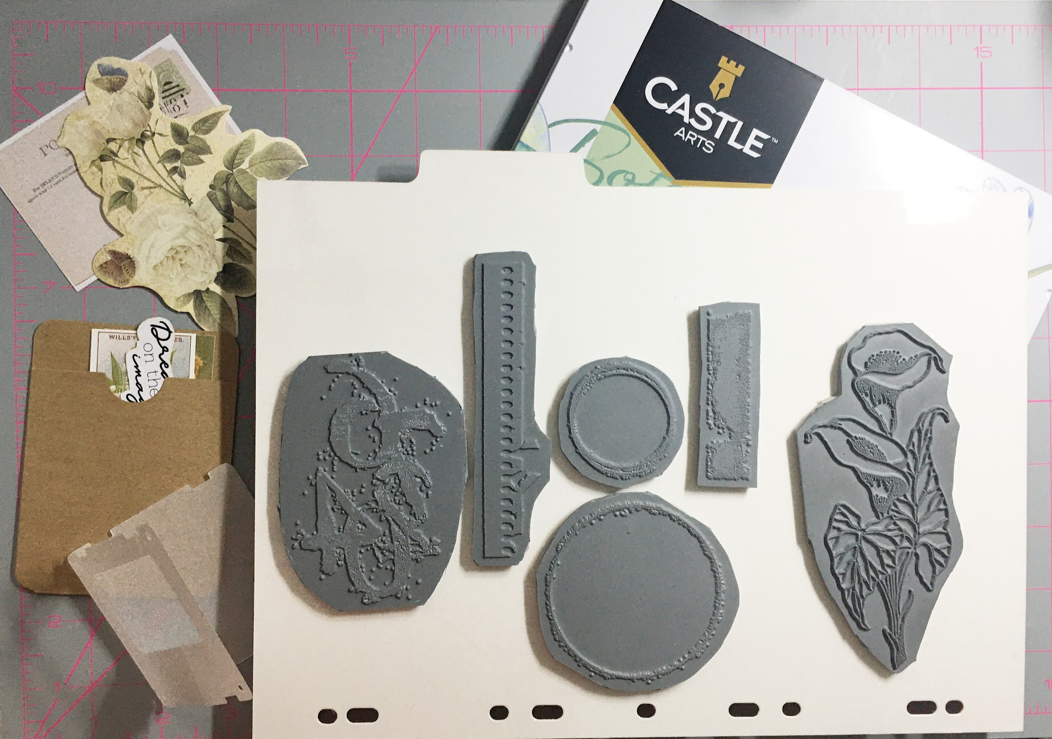
Just Useful stamp set
Make Your Mark stamp set
Flora and Fauna stamp set
Beige ink pad for stamping
Distress Oxide Weathered Wood
Coloured pencils
Assorted ephemera
Assorted ephemera and papers from a vintage pack
Starting your layout
Start by combining ephemera elements into a rough pleasing layout. Keep in mind the elements from your stamps you want to include; for my card these include a stamped image for the photo mount, and each of the two rings. This also gives you a rough idea for positioning the texture images into the background of the card.
Colouring your stamped images
Stamp your main image three times onto some white card using the beige ink. The card you use should be suitable for coloured pencil colouring; I recommend testing a scrap piece prior to stamping.
One image should have the larger circle overlaid, another smaller circle and the last image I roughed out an area that would fill the frame. The circles should highlight focal points of your main image.

Starting with a cream or pale warm yellow (mine was Golden Yellow) colour the back petal around the stamen. Fade the colour out as you move further away from the stamen.
Colour the stamens with orange, tan and brown - orange at the edges and getting darker towards the centre. Colours used from the set I used: Cadmium Orange, Terracotta Light, Raw Umber and Burnt Umber.
The rest of the petal should be coloured from the base up; starting with a touch of light green (Leaf Green Light) to the very base blending from the stem. Then apply grey from the petal base upwards past the green (Payne's Gray). Finally, blend into the white with pale blue (Cerulean Blue Light). Do the same blue grey mix to the shaded areas of the petal.
Stems are coloured in light green as we don't see much of them on these pieces.
Leaves are coloured all over with light green, then the veins are shaded with a darker sage green (Sap Green) and blend with a mid green tone (Permanent Green).

As I was colouring on shimmer cardstock, it did make it a little difficult to get a smooth blend; I think the results fit the theme well though. Trim out your pieces ready for assembly.
Stamp your card blabk with your texture images using both the beige ink and the Distress Oxide; keep your stamping as close to 90 degrees as possible.
Assemble the card
With your pieces now cut, redo your layout without sticking anything. Take a photograph of your layout. Try to keep your elements to a 90 degree - horizontal or vertical to stop your layout looking messy. The photo will help you as you adhere your pieces.
Working back to front adhere your pieces with a little PVA glue; by using less we can always lift at a later stage if needed. Consider your materials; for example, the photo frame I used had been die-cut from vellum which meant a little planning with the adhesive. The coloured panel was aligned to the aperture and the adhered to the back of the frame. Position each piece using a T ruler to keep them straight.
In my card, I found I needed some elements to go over the edge of my DL card blank for them to fit. Instead of cutting them off and losing colouring etc., why not change your design a little. I added a card inset into my design that extends past the card blank size. To make it look intentional, I added a lacy edge using a die.
You can use additional embellishment with washi tape or stickers, but avoid full on bling.
This is fabulous Natalie and it was great to see how it all came together x
ReplyDeleteHow lovely card full of details! Thanks for sharing all the process!
ReplyDeleteBeautiful
ReplyDelete