Pin It button on image hover

Tuesday, 9 November 2021

Beauty by Rachel

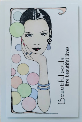
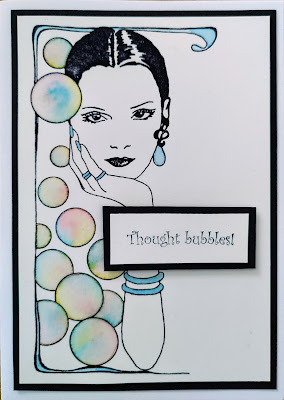
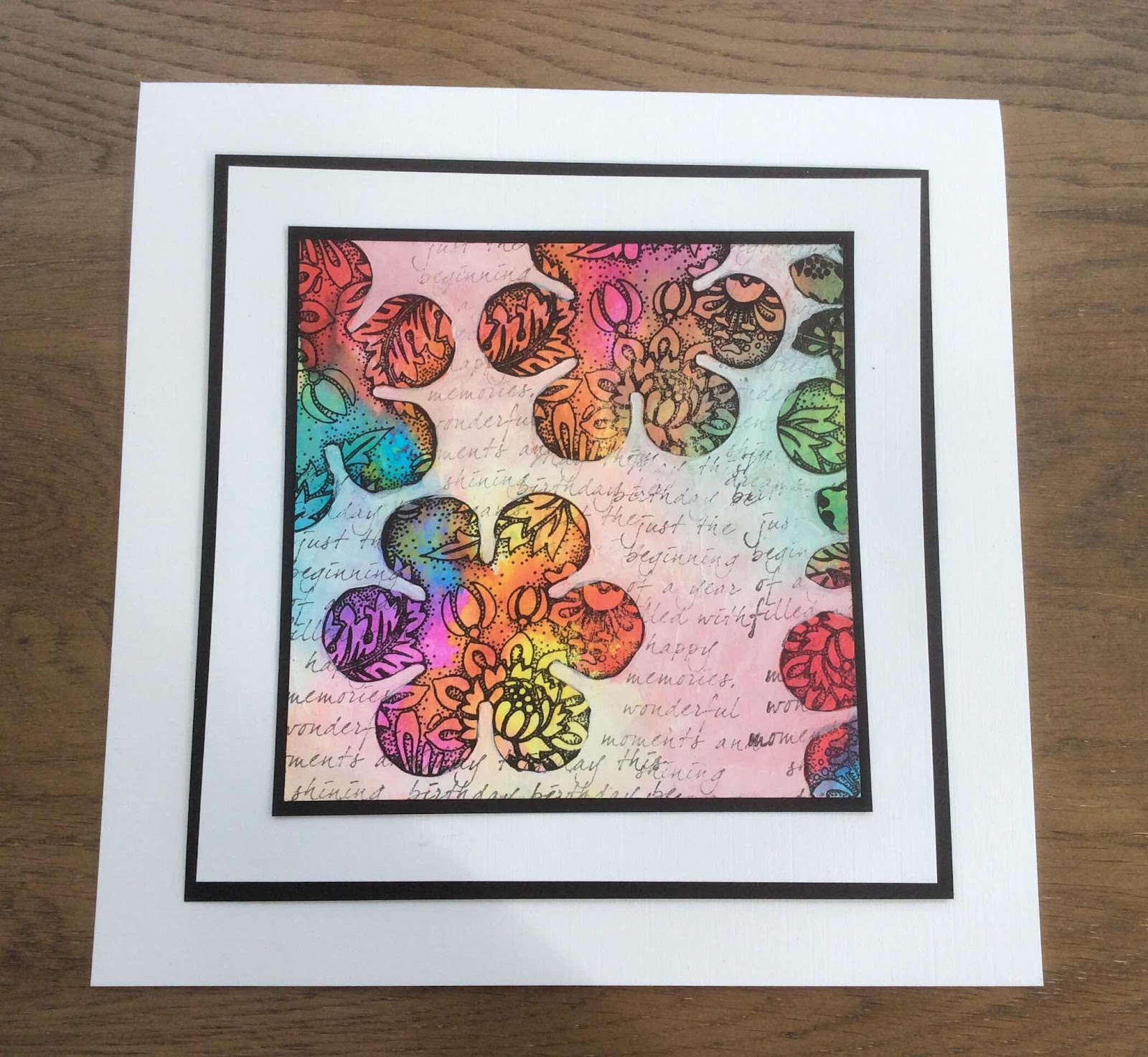
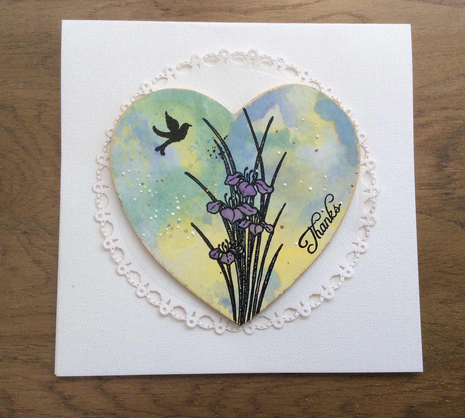
 Hello there! Rachel here today with some makes using the Beauty in the Eyes stamp set released in the October shows. I made a card, a canvas and a tag using this stamp showing its versatility. Its a really striking image that works so well with different techniques.

In this first sample I stamped the image in black ink and coloured it using water colour pens. I then mounted it on papers matching the colour theme I had chosen and also with the circle theme going on.

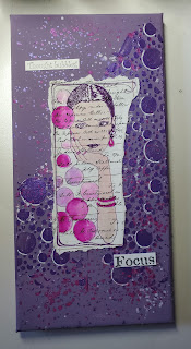
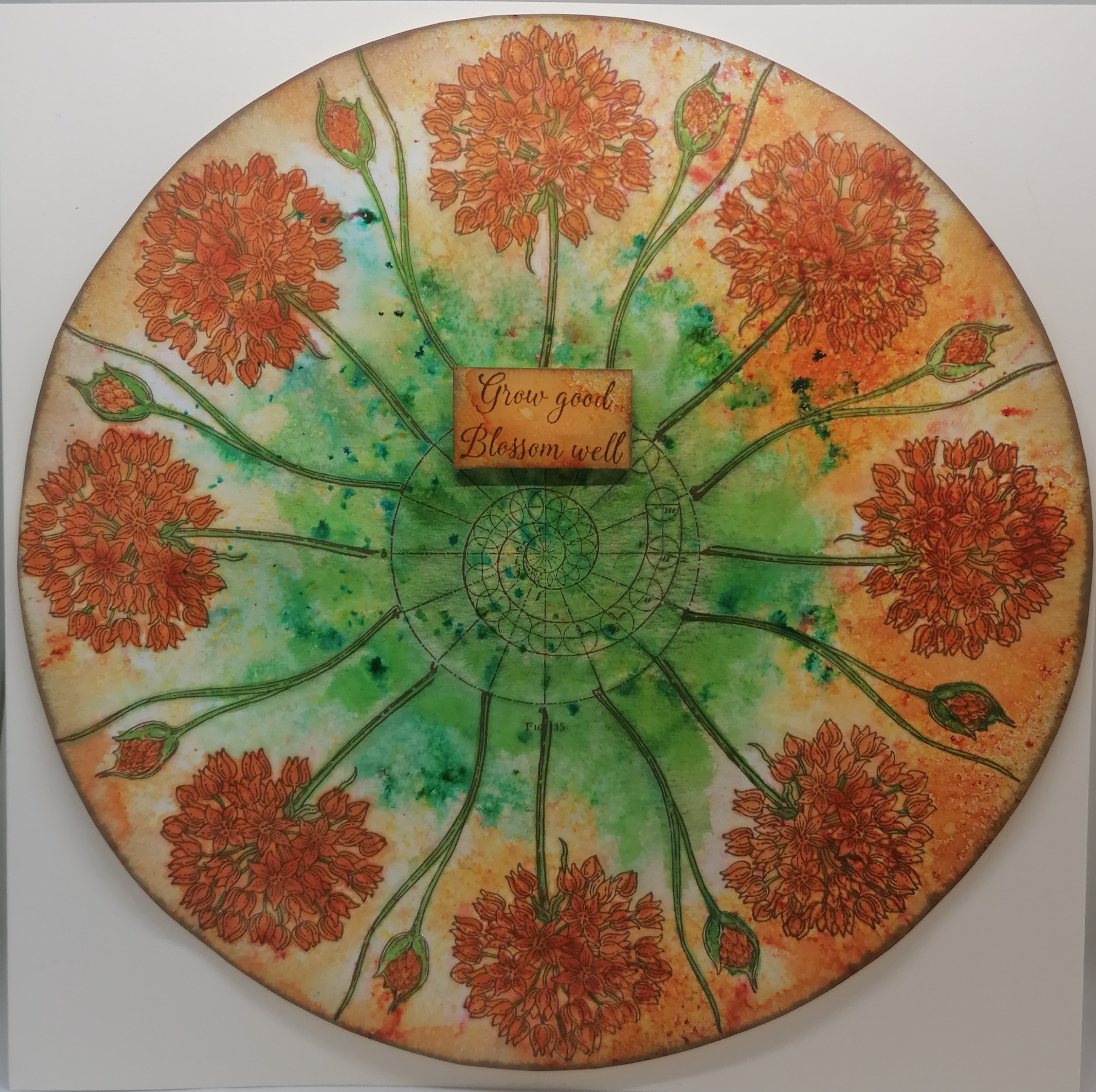
For this next one I stamped the image onto script paper and coloured using water colour pens. I then created the rest of the canvas using similar colours of acrylic paints and also mixing coloured mica powders in with texture paste and using that through a stencil. Once all that was dry I added the image.
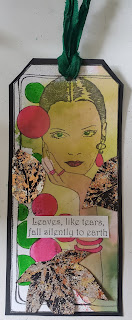
The final one I used a piece of mop up card and stamped on the image. I used a die to cut the tag shape. Then added more colour using water colour pens and finally added some leaves from the 'From nature 1' set that I had stamped and foiled in flake. I then added the black background and the ribbon. 
I hope this has given you some inspiration. Have a great day!
Hugs
Rachel xx


Sunday, 7 November 2021

Xmas Tags and Card - (by Magda) Frosty Trees, A heart full of Love, Fat Robin, Let get Festive

 Hi everyone

I am using to prepare my Xmas tags and cards during this month and I want to share with you what I have done till today.  I will show you the one I will do next week in the second post of this month, so you can have more inspirations for your projects.

I used  Archival Jet black, water color, Distress Ink Pad,  for stamping the lovely rubber stamps A Heart full of Love,  Frosty Trees, Fat Robin and Let get Festive 


Thanks for passing by, hugs
Magda 


Saturday, 6 November 2021

Multi-coloured Stamping using Chocolate Baroque stamps by Natalie Ballard

Multi-coloured stamping

An easy way of colouring your cards quickly is multi-colour stamping. To do this accurately, you need a good quality stamp platform so you can stamp in exactly the same place. I also keep a cotton bud handy to clean up any excess ink.

Simple multi-colour stamping


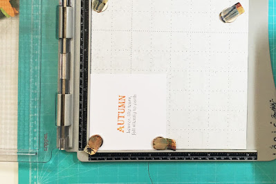
To start with, we will begin with practicing with text stamps. We can use multi-colour stamping to highlight individual words, highlight a point or just for visual interest. Here, I used a sentiment from "From Nature 1" as its ideal to pull out the top line in a complimentary colour for your design.

You will need: a stamp platform, cotton bud and 2 or more colours of ink.

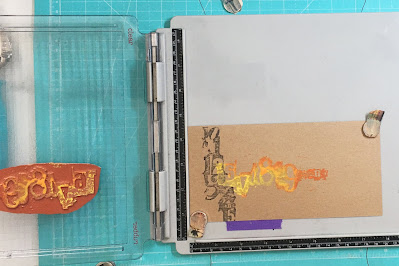
1.     Place your card into your stamp platform. Align your stamp onto your card and close the lid to pick up your stamp. As we are working with rubber stamps, you may need to remove an inner shim in your platform or swap the lid around (each platform varies). 

2.     Next, tap your first colour of ink into your chosen area. Use the cotton bud to mop up any excess to other areas of your stamp. Stamp this first impression and reink and stamp again if required.

3.     With the second colour, apply colour to the other areas of your stamp. Again, use the cotton bud if required. Stamp your sentiment and repeat if required.


You can then decorate the rest of the card as required.

Distress Oxide Blending

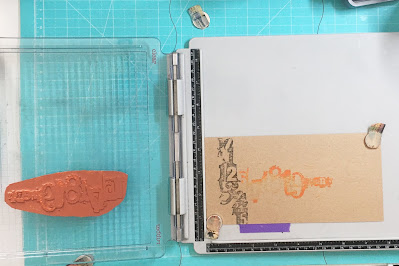
Once you have practiced the above technique, we can move onto image stamps. Bolder designs will work better for this technique so you can see the colour blending. The "Numerology" number stamps are ideal for showcasing this technique due to their bold appearance and larger stamping area.

You will need: a stamp platform, blending tool (such as sponge or blending brush), cotton bud and 2 or more Distress Oxide pads. You can also add a water spray for use with these inks; otherwise, you could also do this technique with other wet pigment pads.

1.     Place your card into your stamp platform. Align your stamp onto your card and close the lid to pick up your stamp. As we are working with rubber stamps, you may need to remove an inner shim in your platform or swap the lid around (each platform varies). 

2.     Next, tap your first colour of ink into your chosen area. Use the cotton bud to mop up any excess to other areas of your stamp, but this time we are going to create a fade off with our ink. Using your blending tool, tap at the edges of the applied ink to soften the transition from ink to no ink. Stamp this first impression and reink, blend and stamp again if required.


3.     Clean your stamp with a damp cloth carefully so the stamp doesn’t shift.

4.     With the second colour, apply colour to the next area of your stamp. Again, use the cotton bud if required, but this time we are going to create a fade off to both ends of the ink. Using your blending tool, tap at the edges of the applied ink to soften the transition from ink to no ink. This fade should overlap the previous blended area of your image. Stamp your sentiment and repeat if required.


5.     Repeat for each colour you wish to use in your blend.

Optional: With Distress Oxides, you can lightly mist your stamp before stamping with colour to activate the oxidisation. This particularly pops on coloured card and especially on kraft card.


Distress Oxide Resist

Distress Oxide has a particularly cool effect when dye ink is applied over the top as it acts as a resist to the dye. I use this technique a lot for giving a distressed look to my stamping using shades of brown, oranges and teals. It works even with detailed stamps, making it a great technique to use with the intricate detail of Chocolate Baroque stamps.

In the sample below, you can see both bold and detailed designs from Punky Romance. They both use the same colours but notice how the detailed image looks lighter. You can vary your ink colours between images if you wish to compensate for this.

You will need: a stamp platform, cotton bud and 1 or more colours of Distress Oxide and a dye based pad.

1.     Place your card into your stamp platform. Align your stamp onto your card and close the lid to pick up your stamp. As we are working with rubber stamps, you may need to remove an inner shim in your platform or swap the lid around (each platform varies). 

2.     Next, lightly tap your first colour of Distress Oxide loosely into your chosen area. You want areas where the ink doesn’t hit to make the resist effect more obvious. Use the cotton bud to mop up any excess to other areas of your stamp. Stamp this first impression. Do not be tempted to reapply at this stage.

3.     Use this same technique for other Distress Oxide colours you wish to include, applying colour lightly to the other areas of your stamp. Again, use the cotton bud if required. Stamp your image.

4.     When your Distress Oxide stamping is complete (you should have a light all over image), clean your stamp and ink it up with your dye ink. Stamp and reapply if required. The Distress Oxide will then reveal itself through your ink.

There are many more multi-coloured stamping techniques I look forward to introducing you to over the coming blog pieces.


 

Friday, 5 November 2021

Wreaths And Notelets (by Tracy Thompson)

 Today I am sharing some projects I created for the October shows, using From Nature and Numerology


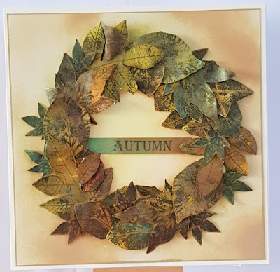
I created this Wreath by spraying card with spray inks in Autumnal colours, then I stamped the leaves from the set called From Nature and fussy cut them out.  I inked a background and then arranged my leaves to form a wreath.  I added a banner across the centre saying Autumn.

For my next project I created a Notelet set, 

This is the front of the folder for the notelet set, I did a background piece with Distress inks, then on another piece of card I stamped some leaves and the word Autumn.  I used the splatter from Numerology to add in between.


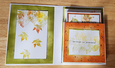
Inside the notelet folder on the left hand side I did some more stamping and then on the right side I made a pocket.


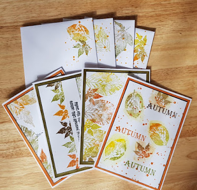
I made four notelets with matching envelopes, all with different designs, using autumnal coloured inks.  

I will be back later in the month with another post with more of my creations 

Happy crafting
Tracy x


Thursday, 4 November 2021

autumn leaves (by Veronica)

For my first post this month I have used the gorgeous new stamps from nature which are perfect for this time of the year.

My first card also uses the frame and bubbles from beauty is in the eyes. I inked the frame and bubbles using a small dye ink pad in a  honey colour and wiped any ink off the rest of the image before stamping onto the edge of a square of card. Reinked the stamp, turned the card round and stamped on the opposite edge. I used a waterbrush to pull the colour out in the frame and on some of the bubbles.
The big leaf spray was inked in the same ink and stamped at an angle across the card, reinked with some orange and green ink added randomly overlapping the first image.  Inked up a third time with thew orange and green inks and stamped more vertically over the other images. Finally inked in black ink and stamped again - I used a stamping platform to match up the images. the sentiments were stamped on scraps of card coloured with the same inks

A  wreath card using a stamping platform and the small leaf stamp inked in green ink. The large leaves were stamped in green ink onto card cololured with brusho powders and fussy cut out before gluing in place and adding the sentiment stamped in black onto a spare piece of card


A simpler wreath just using the small leaf stamp again, stamped alternately in green and yellow inks 
 

Wednesday, 3 November 2021

Let's Face It by Sandra

 Hello

I'm sharing some of my cards from the October show on The Craft Store. These cards show different colouring techniques for the Beauty is in the Eyes stamp set.

For my first card I stamped the image onto some smooth card stock with Memento ink and then used my alcohol markers to colour. I love the soft pastel colours with the pop of red on her lips and nails. I finished with a sentiment and layered onto a DL sized card.


My next card uses some of Chocolate Baroque's Drawing Cartridge, a lovely paper that can take quite a lot of water. I stamped the image in archival ink I then added water to the bubbles with a brush. Whilst the bubbles were still wet I added small amounts of watercolour ink and let the colours run into each other. When it wad dry I added a sentiment and layered onto black card.


For my last card I stamped in brown Archival ink and coloured with  the Shimmer paints that I managed to get from the September show. It's a shame you can't see the sparkle!


Thanks for looking

Sandra x

http://isthatthetime.blogspot.com/

Tuesday, 2 November 2021

Blog Comment Winner


Hello and welcome to the Chocolate Baroque Design Team Blog.


We truly appreciate the time you take to let us know your thoughts about our designs, so each and every comment is very important to us.


Each comment in October was assigned a number and we used Random Org to draw a winner.


Congratulations to Alice (ScrAPpamondo)  you have won this month's £15.00 voucher to spend on Chocolate Baroque stamps.

To claim your prize, please email here to confirm your email address and Lesley will send your gift certificate.


Lesley will be giving a £15 gift voucher to another lucky winner drawn from the November comments.


The more comments you leave, the better your chances of being the winner.


Thank you so much for all the kind comments you leave.


Good luck from all on the Design Team


Here is another chance to see the beautiful creation by Zoe


Monday, 1 November 2021

Beautiful Autumn (by Judith)

Hello everyone, I hope that you are keeping well. We are really into the Autumnal weather now, the leaves are falling and the windy days are here. I love this time of year, we still get the odd sunny day, and it is not too cold for a good walk. I hope that you caught last month's TV shows, and saw the fabulous new stamp sets that Lesley brought to The Craft Store. The Design Team have had so much fun playing with these stamp sets, and you will be truly inspired by what they have to share with you this month.

I have three projects to share with you today. My first card was created on a left over background from another project. I had painted over a piece of scrapbook paper with a wash of white acrylic paint and added some stencilling with blue and orange Distress Oxide Ink. Some subtle stamping had been added with the same colour ink; butterflies, clocks, and splatters, etc. These colours dictacted the colours that I then chose for the rest of my project. 

I stamped Beauty is in the Eyes using Versafine Onyx Black and extended the bottom frame using a fineliner pen. I used the same pen and a circle stencil to draw extra bubbles on the right hand side. I coloured the image with pencils, and added white highlights with a gel pen. I had another scrap background for the larger background, created using acrylic sprays. Always keep your left over backgrounds, you never know when you might need them! I matted both backgrounds with black card for extra drama. The little word 'Focus' comes from the same stamp set.

My second project is a small chipboard panel. I used a piece of decorative paper and stamped one of the leaves from From Nature 1 across the background using green ink. I stamped and embossed the large leaf spray from the same stamp set onto kraft card using white embossing powder. I also stamped and embossed just the face from Beauty is in the Eyes, and the flower from Floral Grunge, also onto kraft card using white embossing powder.

I added a sentiment to the background paper, before attaching it to the chipboard panel with matte medium. Once the adhesive was dry, I sanded the edges to get a white edge. I coloured the face and flower with pencils, and inked the leaves with Distress Ink. I attached all of the images to the panel for a collaged effect.

My final project mixes and matches stamp sets, something that I really enjoy doing. I have used Distress Inks to create a blended background, and then taken a branch from the Sticks and Stones stamp set which I have stamped in first and second generation stamping, using a brown Versafine Clair ink. I have coloured in the first generation branches using brown pencil, and the second generation using a mixture of grey and brown pencils, to make them appear to be in the background. I have then used a mixture of Autumn colours to stamp the lovely leaf from From Nature 1 in first, second and third generation stamping across the branches. Finally I have added my absolute favourite Chocolate Baroque sentiment to the card. This comes from the Nature's Peace stamp set. As Design Team Leader, I should probably not have favourites, but I am still human, and I adore this stamp! I knew as soon as saw the stamp set From Nature 1 that I wanted to create this card, sometimes a card design just pops into your head.

Thanks so much for stopping by, take care,

Judith xx


Sunday, 31 October 2021

Stepping back in time part 3 by Zoe

Good morning Lovelies and welcome to my final post this month featuring some of my older favourite creations.

I was unable to make samples for last months shows unfortunately.

This was an interesting technique and such fun.
Starting off by just adding colours to the card, I used a blending tool and Distress inks but anything to get loads of colour would be fine, I then stamped the flowers and very carefully painted around the with Gesso, it tones down the colour without obliterating it completely, then second generation stamped the script using a grey ink, just to add more texture without taking the beauty of the flowers away.


This card I used a textured cardstock and a die to create a doily style layer for my Greyboard heart which had been sploshed about in Distress Oxide inks on a mat with water to create a marble type background.


Thank you so much for spending time and visiting today.

Happy crafting and see you next month xx Zoe xx 

Saturday, 30 October 2021

Alliums in Blueprint (by Doreen)

 Alliums in Blueprint

Hello to you all, here we are and October is almost over, how scary is that ?

Today is my last post of the month and although this first sample may look tricky it's not as bad as it seems at first.

Using the Allium Blueprint and a Blue Inkpad of choice, Stazon may be a good choice as it dries very quickly and is unlikely to smudge.

Firstly I cut a square piece of white card 8"x 8" and marked the centre point on the north, south, east and west of the card, align the stamp with the points and stamp the four points and then fill in the gaps, the base of the stamps will overlap slightly but I didn't mind this although I did take the little pieces on either side off the stamp but if you prefer not to just remove the ink carefully with a damp cloth. I have used another blueprint stamp in the centre or you could just as easily replace it with a sentiment.

I mounted the topper onto a square piece of pearlescent card from my stash the same size as my base card. Trim the topper before adding to the base card, I always find this easier if I turn the topper away from me and cut along the matt card.

Simple but perfect card for men who will appreciate the Blueprint detail and it will look good in whatever colour you choose to use. 


A few more samples from this stamp set which no matter how you choose to use it will look good. 


It has been good to re-visit the Blueprint stamps this month, I hope you have enjoyed seeing them all.
Thank you for looking in 
Love Doreen

Friday, 29 October 2021

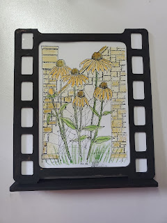
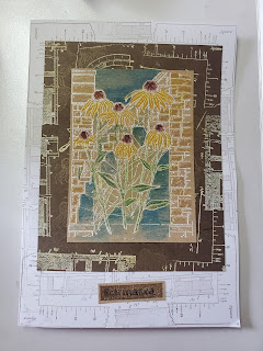
Echinacea all the way - by Rachel

 Hello there. Rachel here today with my final set of inspiration from the September shows - this time using the Echinacea Blueprint set. In this first sample I used an MDF film strip stand that I bought in a previous show and gessoed it black. I then created the central portion by stamping the main image on card and colouring using water colour pencils.

In this final piece I stamped the backgound to the card using worker stamps then the main focus was stamped in versamark and heat set with white embossing powder before colouring in using water colour pencils. The layer in between was kraft card given the stamping and versamark/embossing powder treatment. 
Hope you've found some inspiration from my makes this month - I always enjoy making for the shows - the stamps are so intricate. Love them!
Have a great day!
Hugs
Rachel xx


Wednesday, 27 October 2021

Winter Dawn (by Carole)

Hello everyone

My last project for this GDT slot is a Winter theme using the beautiful Winter Dawn stamp (UA6SP0525). I have used the other three quite a lot as they are very pretty images, but Winter Dawn has been neglected for some reason. 😃

So here she is. 

The frame is 25cm.one I had in my stash. Just right for the 15cm. heart to fit in the centre.

The heart is a good quality birch wood which has been sanded to a lovely smooth finish. This is suitable for stamping directly onto the wood without prepping it first, using a suitable inkpad.

Some inkpads will bleed, which you don't want. I have used Versafine Blue on mine and it is useful to use a drier pad rather than a squidgy new one 😃. Stazon works well too.

The image has been coloured with watercolour pencils and white gel pen, for the flakes.

It is edged with tiny beads to finish it.

The background sheet has the was resist technique again, (see last week's post), and then overstamped with snowflakes which have been white embossed.

The edging is finished with little pearls.

I hope you have enjoyed this project and revisit this lovely series of stamps.Happy crafting to you all and thank you fr visiting Chocolate Baroque's blog.

Carole 😀

Monday, 25 October 2021

A Lightbulb Moment (Tracy Thompson)

 Hello again, I'm here with my final post of the month with creations I made for September;s show on The Craft Store.


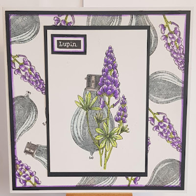
For this creation I created a background piece by randomly stamping the bulb and the lupin, I coloured the Lupins with inks and glittered the highlights in the bulb.  I then took the main image from the stamp set Lupin Blueprint and coloured it with inks, I took the sentiment from the set and layered it up and placed it on the main image in the corner.


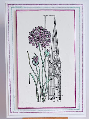
Now for this next card I tried something a little bit different, instead of colouring with markers or inks I coloured with glitters.  So To start I took a piece of card so use as a base to adhere to the card blank, using a glue pen I drew a line around the edge then glittered in purple.  I did the same again and glittered in green.  I stamped my main image from the Allium Blueprint set, and on the blueprint drawing part I shaded it in grey.  I then using a glue pen again coloured in the Allium, stems and leaves and in the same glitters as used around the edge coloured the image.  I'm just sorry all the sparkle doesn't show on the picture.

Thank you for taking the time to look at my post
Happy crafting
Tracy x


Sunday, 24 October 2021

floral blueprints (by Veronica)

For my last post this month I have a set of  very simple DL cards using the main images from each of the blueprint sets featured in last month's tv show. All the base cards are of  a dark silver card, and the images stamped on white card with black versafine ink.

The flowers were coloured with  koh-i-noor  pencils and blending solution, and the sentiments were stamped onto spare white card. The sentiment on the echinacea card is from life is so much better.


Saturday, 23 October 2021

Floral Blueprints

Hello, I am sharing  some more of my Blueprint cards from the September show on The Craft Store.
The stamps that I am using are from Echinacea Blueprint and Lupin Blueprint.

On my first card I made a background using Distress Inks which I then sprinkled with water and blotted to lift the ink. I then stamped around the edges with some of the smaller stamps to create a border. I stamped the main image onto some card, again I used Distress Inks to make a background and I coloured the flowers with water colour pens.  I used oval shaped dies to cut out the Echinacea image and layered onto black.


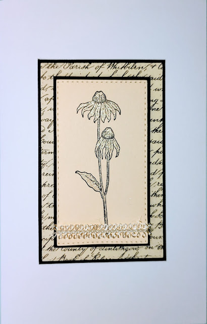
My next card is very simple. I had a small piece of script paper which I layered onto some black card.
I stamped the smaller echinacea flower onto some cream card and coloured with a silver sparkly pen. I added a piece of ribbon around the lower part of the card and mat and layered this onto some black card and then onto the script layer.


My last card uses the Lupin Blueprint set. I made a background by using Versafine Clair on the Inky Plate. I then used one of the stamps to frame the edge of the card. I used my stamping platform to stamp the main image of the lupin and lightbulb, coloured with water colour pens and then stamped the image again to make it look nice and clear.


Thanks for looking
Sandra x


Friday, 22 October 2021

Stamping on Coloured Surfaces (by Judith)

Hello everyone, I hope that you are keeping well. I have a couple of projects to share with you today showcasing the stamps from last month's shows on The Craft Store.

For my first card, I decided to stamp the main image from the Chrysanthemum Blueprint stamp set onto a piece of die cut grey card. I coloured the image with pencils, choosing a palette of mostly orange and yellow to pop against the grey background. Even the green was a zingy yellowy green hue to stand out against the grey. I added lots of white highlights to lift the image.

I created a background using grey Distress Ink on Drawing Cartridge, which was not too fussy, and left lots of white areas. I felt that this worked well for the darker coloured topper in this instance. As with a lot of my cards, I did not add a sentiment, as I quite often add one when I send a card. This card would be useful for lots of different occasions.


My second card also features a coloured background for the focal image; this time I decided to stamp on kraft card. I stamped the main image from the Allium Blueprint stamp set using Versafine Onyx Black Ink, and coloured it with pencils, as before. I used a tea dyed background, and stamped one of the smaller allium heads using a plum coloured ink. Both layers of card were edged with the plum coloured ink before attaching them to the base card.

Thanks for stopping by, take care,


Judith xx


Thursday, 21 October 2021

Stepping back in time by Zoe

Good morning Lovelies and welcome to my post.

I’m showcasing some of my older creations as unfortunately I was unable to make samples for last months shows.

A trio of Bookmarks.

A Calendar Page


Thank you so much for spending your time visiting today.

Have a wonderful day xx Zoe xx


Wednesday, 20 October 2021

Wax Paper Technique (by Carole)

Hello again.

Hope you are enjoying your crafting with the beautiful new stamps which were featured on The Craft Store recently.

My sample this time uses a pretty stamp from the Butterfly Poppy Collage set and an older technique which seems to have gone out of favour or been forgotten! 😊

I stamped the butterfly panel from Butterfly Poppy Collage and then stamped it again and embossed with clear embossing powder. This was torn and cut out to add a bit of depth.

The white panel behind was embossed with a diamond folder to mirror the stamp diamonds. Unfortunately this not showing in the photo.

The background is done with the wax paper technique which is simple to do and can give interesting results.

My card has the wax paper scrunched up, but you can put it through in an embossing folder to get different patterns.

I scrunched the wax paper, smoothed it out and ironed it onto my piece of card. Use a piece of copy paper on top to iron. Please don't use your main iron in case the wax seeps through the paper onto the iron!

The pattern from the wax will act as a resist so that when you ink over, the pattern 'pops'.

I like this technique as it is quick and simple and the wax paper can be manipulated to get different patterns.

I hope you have liked this.

See you next week

Carole.